Redesigning Enterprise Financial Workflows at Scale
GE Healthcare's commercial teams managed quotes, renewals, upgrades, and asset
requests across fragmented internal systems. Manual work, duplicated data, and
disconnected workflows slowed decision-making and increased operational overhead.
My goal was to design a centralized platform that streamlined these processes
while giving users greater autonomy.
User Experience (UX) DesignUsability TestingWireframingUser Interface (UI)UX Research
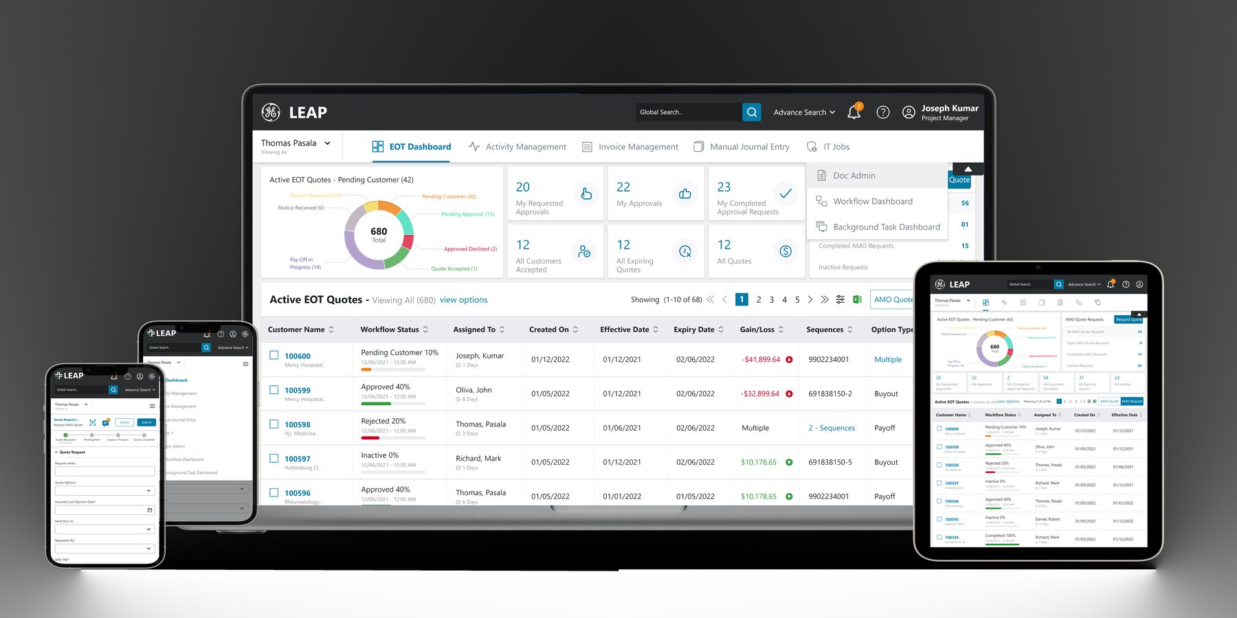
This reflects real work on GE Healthcare's live platform, shown here in full — screens,
workflows, and approach are the genuine story. Because it's an active enterprise client
engagement, customer names and figures shown are demo/anonymized data, and business
metrics below are kept approximate and directional per the NDA covering this engagement.
Cross-functional Team
2Technical Architects
4Full Stack Developers
4Angular UI Developers
2.NET Developers
5QA Engineers
1Cloud / DevOps Engineer
3UX/UI Designers
2Support Analysts
🧭 Problem
Financial services teams were managing fragmented, disconnected systems for quote generation, asset requests, renewals, and upgrades — relying on manual data entry with no unified source of truth, and voicing frustration with low productivity and a lack of integration.
💡 Solution
I led the redesign of quote generation and asset management workflows — creating the information architecture, designing the dashboard, and validating it through usability testing — while also contributing hands-on Angular frontend development to help close the gap between design and implementation.
📊 Impact
Reduced quote preparation time
↓ Fewer manual approvals
↓ Centralized data
↓ Role-based workflows
↓ Higher adoption
02 🔍 Research
Financial services teams were managing
fragmented, dispersed
systems for quotes, renewals, and vouchers, with no unified source of truth.
Problem statement
Financial services workflows required a centralized platform to address inefficiencies and fragmentation
Users relied on manual data entry and disconnected systems for quotes, renewals, and upgrades
Managers needed to independently raise and track requests without relying on other teams
Users voiced frustration with low productivity and the overall lack of integration
Research included stakeholder workshops with financial services teams and usability
testing sessions with end users on wireframes and prototypes.
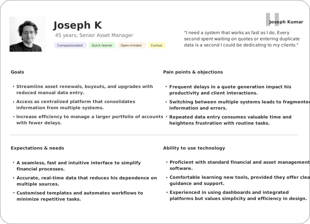
What the persona's goals implied
Efficiency is key
Joseph values streamlined processes that reduce redundant tasks, boosting his productivity and allowing more focus on client relationships.
Centralization is essential
Workflow fragmentation disrupts Joseph's productivity; a unified platform consolidating data eliminates back-and-forth decision-making.
Reliability and simplicity
Joseph prioritizes intuitive, reliable tools with minimal learning curve that enhance day-to-day workflow without a steep learning curve.
Time-sensitive information matters
Fast, real-time data processing is crucial in quote preparation — expectations, filters, and interactions all need to reduce time and effort.
Key findings from research
High demand for efficiency
Users like Joseph value processes that reduce manual tasks and streamline workflows, which directly impacts their productivity and satisfaction.
Need for data centralization
Fragmentation across multiple systems leads to inefficiencies; users perform noticeably better with minimal, well-organized navigation.
Preference for intuitive tools
Users seek easy, no-nonsense systems that require minimal training and support their existing mental model of the workflow.
Importance of speed in task completion
Real-time data processing, especially in quote preparation, is essential — it lets users reduce dead time and errors caused by manual re-entry.
03 🛠️ Approach
A centralized, role-based platform for quote generation and asset management.
I led the redesign end to end: creating the information architecture, designing the
dashboard and quote workflows, and validating the design through usability testing.
To solve these issues, I designed a centralized, mission-ready platform by
automating repetitive tasks and consolidating data into a user-friendly interface.
With role-based access, I allowed users to independently manage requests for quote
generation without waiting on other teams, enhancing accessibility and autonomy
while improving overall efficiency and user satisfaction. I also contributed
hands-on Angular frontend development, working closely with the engineering team to
keep implementation faithful to the design intent.
Before
Fragmented systems ↓ Manual data entry ↓ Duplicated records ↓ No shared visibility
After
Centralized platform ↓ Role-based access ↓ Automated workflows ↓ Single source of truth
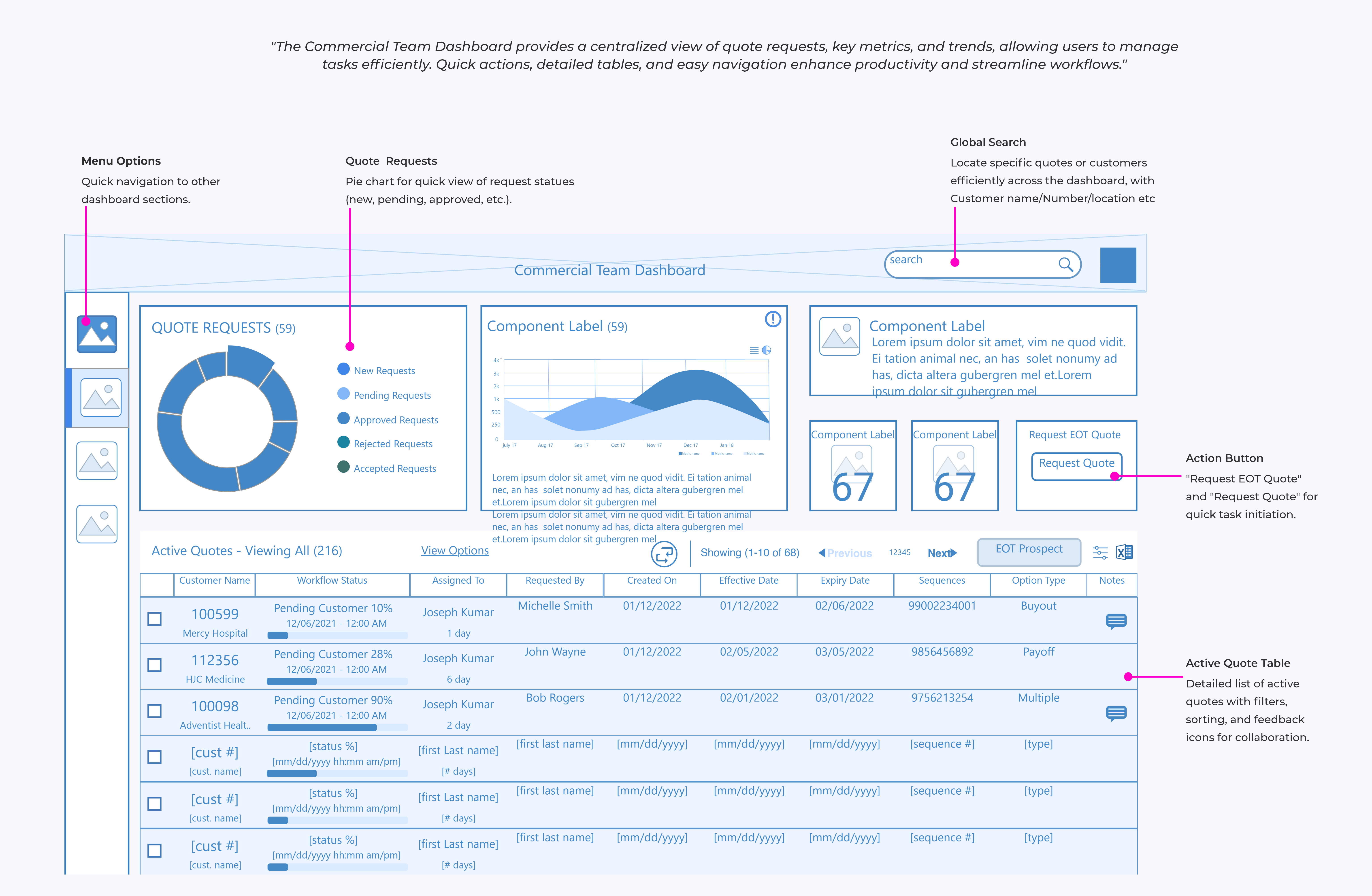
Rapid wireframes to lock the structure first.
Menu options — quick navigation across action items
Quote request — flow for quote generation requests
Actionable alerts — surfaced directly on the dashboard
Active / inactive quotes — view all quotes at a glance
Usability testing shaped the key changes.
I planned and conducted usability testing sessions on the initial wireframes,
covering core tasks like raising a quote request, searching and filtering active
quotes, and reading status updates — to gather insight into user interactions,
identify pain points, and collect feedback on usability. Based on that feedback, I
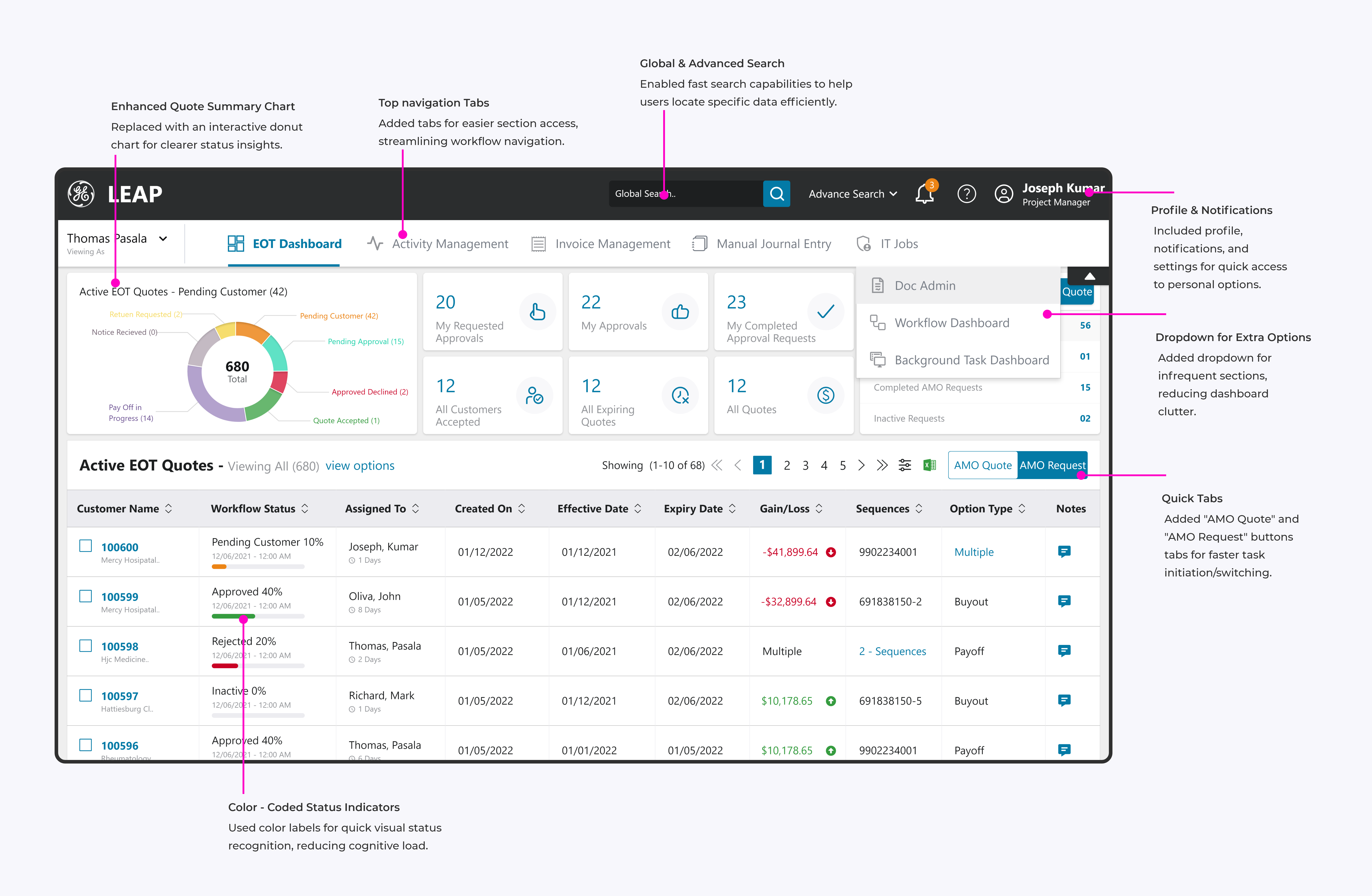
made key changes: streamlined navigation, color-coded status indicators, enhanced
search capabilities, and quick action buttons — updates designed to improve
accessibility, reduce task-completion time, and create a more intuitive, efficient
experience across the final dashboard.
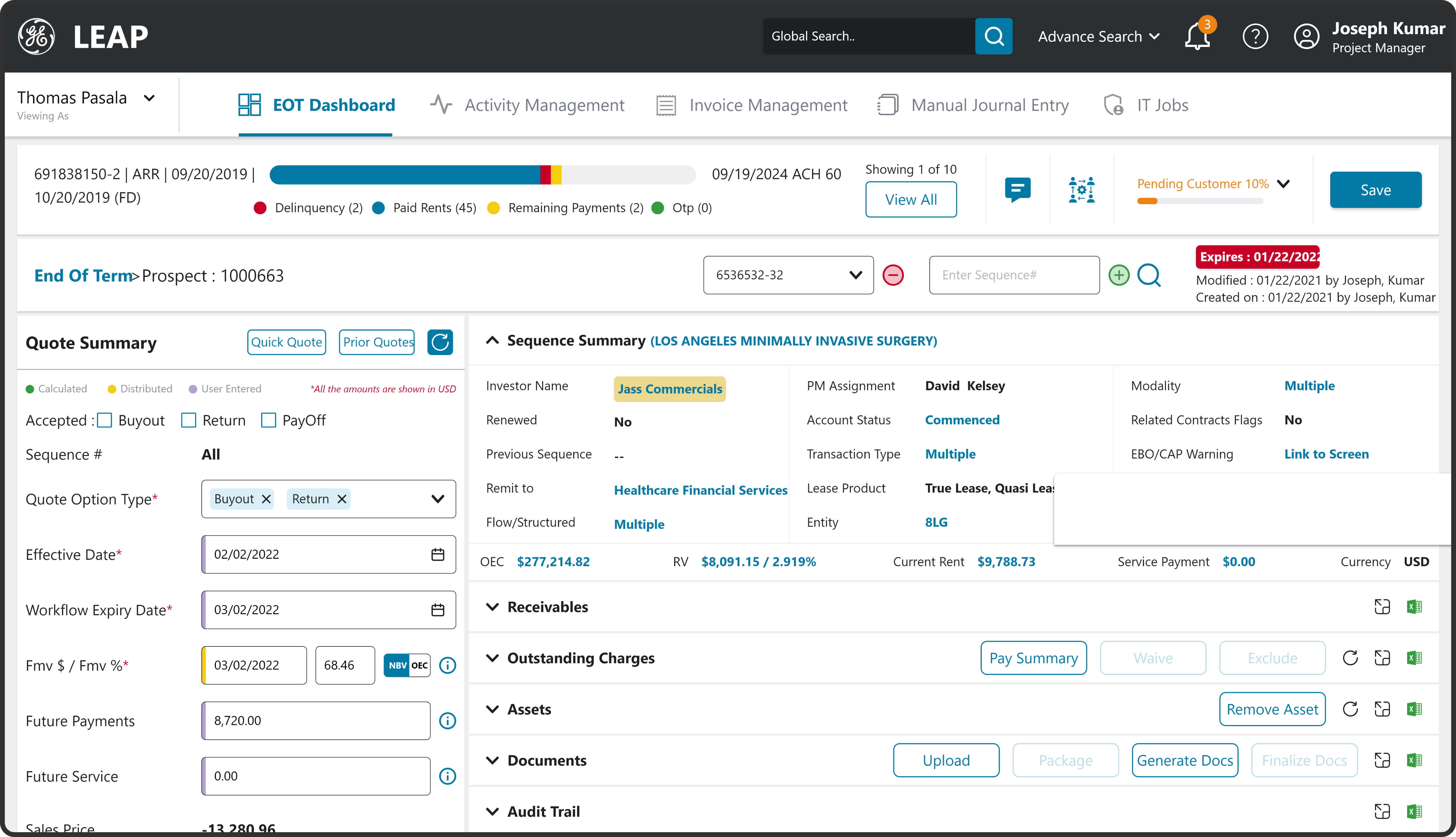
Enhanced quick summary panel — key totals visible without drilling in
Top navigation tabs — faster switching between core workflows
Advanced & enhanced search — instant lookup with saved filters
Color-coded status indicators — status readable at a glance
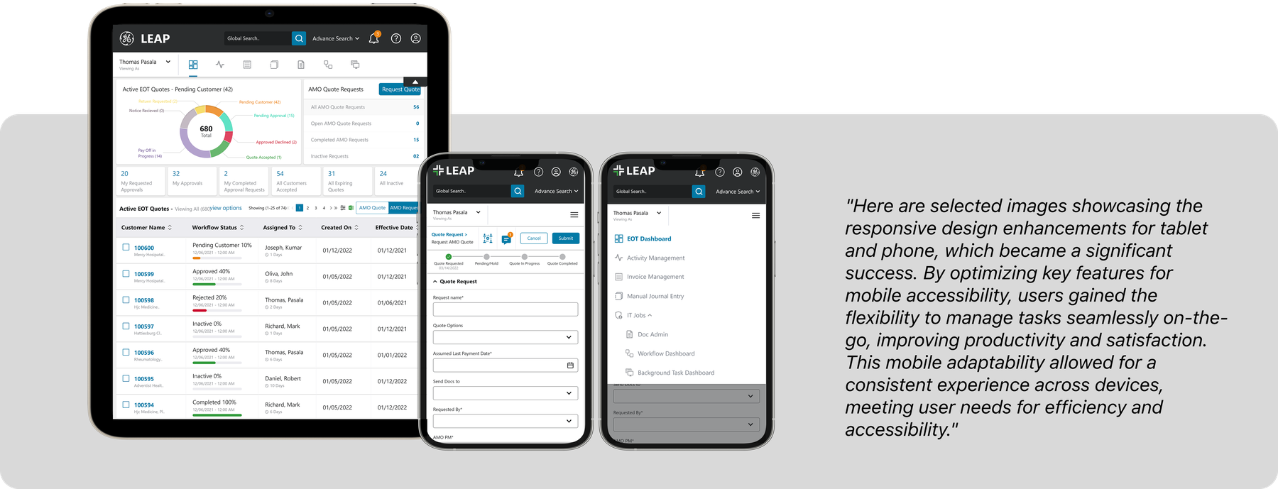
Asset managers needed to check quote status and act on alerts wherever they were
working, not only at a desktop — matching the persona's own goal of managing a
larger portfolio without being tied to one device. Responsive support meant the
platform stayed useful outside a fixed desk setup, not just technically accessible
on a smaller screen.
Customer names and figures shown above are demo/anonymized data, consistent with the note at the top of this page.
04 🎨 Designing with the GE HealthCare Ethos Design System
Modernizing the platform to align with GE HealthCare's new design language.
When GE HealthCare introduced the
Ethos Design System
following its brand evolution, one of my key responsibilities was modernizing the
financing platform to align with the new design language. Beyond migrating legacy
workflows, I also contributed to reusable components that improved consistency
across enterprise applications.
My Contribution
Migrated multiple enterprise workflows to align with the Ethos Design System
Redesigned legacy screens using standardized layouts, typography, spacing, and interaction patterns
Designed reusable components including Accordion, Dropdown, Filter, Navigation, and Modal/Popup patterns
Collaborated with Product Managers, Business Analysts, and Angular developers to ensure accurate implementation
Conducted design QA to maintain consistency across the application
Design Decisions
Instead of creating custom UI for every workflow, I prioritized reusable patterns
that reduced cognitive load and helped users navigate complex financial processes
more efficiently.
Where business requirements extended beyond existing components, I worked on
designing scalable patterns that aligned with the Ethos Design System while
addressing product-specific needs. This approach improved visual consistency,
simplified future enhancements, and created a shared language between design and
engineering teams.
Beyond applying the design system, I contributed to its evolution by designing
reusable enterprise components and leading the migration of legacy workflows to
create a more consistent and scalable user experience.
Key Outcome
Modernized the application to align with the Ethos Design System
Contributed reusable enterprise components adopted across workflows
Improved consistency across multiple business modules
Enabled faster collaboration between design and engineering
Not every redesign is a single decision — some are a back-and-forth.
Constraint & Iteration
Designing the Workflow Status View
The challenge
As the platform scaled and workflow volume grew, the original quote-status
visualization — a simple pie chart — stopped giving the PMO team enough detail to
act quickly. What followed wasn't a single redesign but a genuine iterative
back-and-forth: each stakeholder review surfaced a new requirement I hadn't
anticipated, and each one carried its own technical implications.
Pie chart → Bar graph: The PMO wanted to see the status of every workflow at a glance, not just a proportional breakdown — a bar view could show individual workflow items directly, which the pie chart structurally couldn't.
Bar graph → Progress view: The bar view required scrolling once volume grew, which the PMO explicitly didn't want — pushing me toward a view that could show status without depending on scroll depth.
Progress view → Card view: The next ask was to see status broken down by individual workflow step, not just overall progress — which meant restructuring the data model behind the view, not just the visual treatment.
Card view → Live updates: The final requirement — real-time status updates — introduced a genuine technical constraint: a live-updating view has real implications for data refresh performance and backend load, not just a UI change.
How I handled it
Rather than treating each new requirement as a full restart, I kept the underlying
data structure (workflow status, by step) consistent across iterations, so each
visual pivot was a presentation change rather than a rebuild — which is what made it
possible to keep pace with requirements shifting meeting to meeting. For the
live-updates requirement specifically, I worked with engineering to understand what
refresh rate was actually sustainable at scale, rather than designing an ideal
real-time experience the backend couldn't support.
The outcome
The final card-based view with live status updates gave the PMO what they'd been
asking for across every iteration — at-a-glance visibility into individual workflow
steps, without scroll dependency, updated in real time.
What I'd do differently
Push for a more structured requirements-validation session upfront — even a single
round of "show me three rough directions before we build any of them" likely would
have surfaced the scroll and step-level requirements earlier, rather than discovering
them one meeting at a time. It's a good reminder that fast iteration is valuable, but
it's not a substitute for front-loading discovery when the stakeholder's mental model
is still evolving too.
06 📊 Impact
Notable gains in satisfaction, efficiency, and productivity.
Business Impact
Adoption scaled across several teams as the platform consolidated work that used to run through disconnected tools, with improved cross-team collaboration.
User Impact
Greater autonomy and accessibility for users — quote preparation time was cut substantially, and stated satisfaction improved with a seamless experience across devices.
Operational Impact
Processed quotes increased and manual work dropped, as role-based access let users manage their own requests without waiting on other teams.
600+Asset management requests handled5,000+Quotes generated through the platform~$21MValue processed through the platform7,000+Vouchers processed2,000+Invoice cancellations handled
★★★★★
"This has completely streamlined my daily tasks. What used to take hours now only takes a few minutes, letting me focus more on client management."
Senior Asset ManagerFinancial Services team
★★★★★
"I now have full autonomy to raise and track quote requests without relying on others. It's a real change for efficiency and team productivity."
Asset Manager, Team LeadFinancial Services team
★★★★★
"The platform's responsiveness on mobile means I can manage tasks anytime, anywhere. It's boosted my productivity and cut delays in our workflow."
Field Operations ManagerFinancial Services team
Quoted with role-based attribution rather than full names, since I don't have explicit confirmation these reviewers consented to being publicly named.
Key learnings
User-centered design boosts adoption. Prioritizing user needs enhances satisfaction and drives engagement.
Enterprise software means balancing simplicity with complexity. Removing one step for users often meant coordinating changes across multiple backend systems and stakeholders, not just a screen redesign.
Iterative usability testing streamlines workflows. Early, lightweight testing found real problems before they became expensive to fix.
Performance optimization enhances experience. Faster processing times directly improve efficiency and satisfaction.
The biggest learning from this project was designing for systems, not just screens.
It sharpened my ability to structure workflows, work across cross-functional teams,
and turn operational complexity into clearer digital experiences.
Everything above — the scope, role, screens, and design approach — is the real project.
Because it's an active enterprise engagement with GE Healthcare, exact financial figures
and some internal tooling details stay approximate here per the NDA covering this work.
Happy to go deeper on any of it in conversation.
Since this initial redesign, I've continued leading design on the GE Healthcare account —
extending the design system to new modules and updated views introduced under the
platform's evolving design guidelines.
 Arpan Sheth