Arpan Sheth Arpan Sheth

01 Travel Platform Case Study

GolfPac Travel β€” Modernizing a Dated Golf Travel Platform

Aug 2024 – Sep 2025 · Shipped
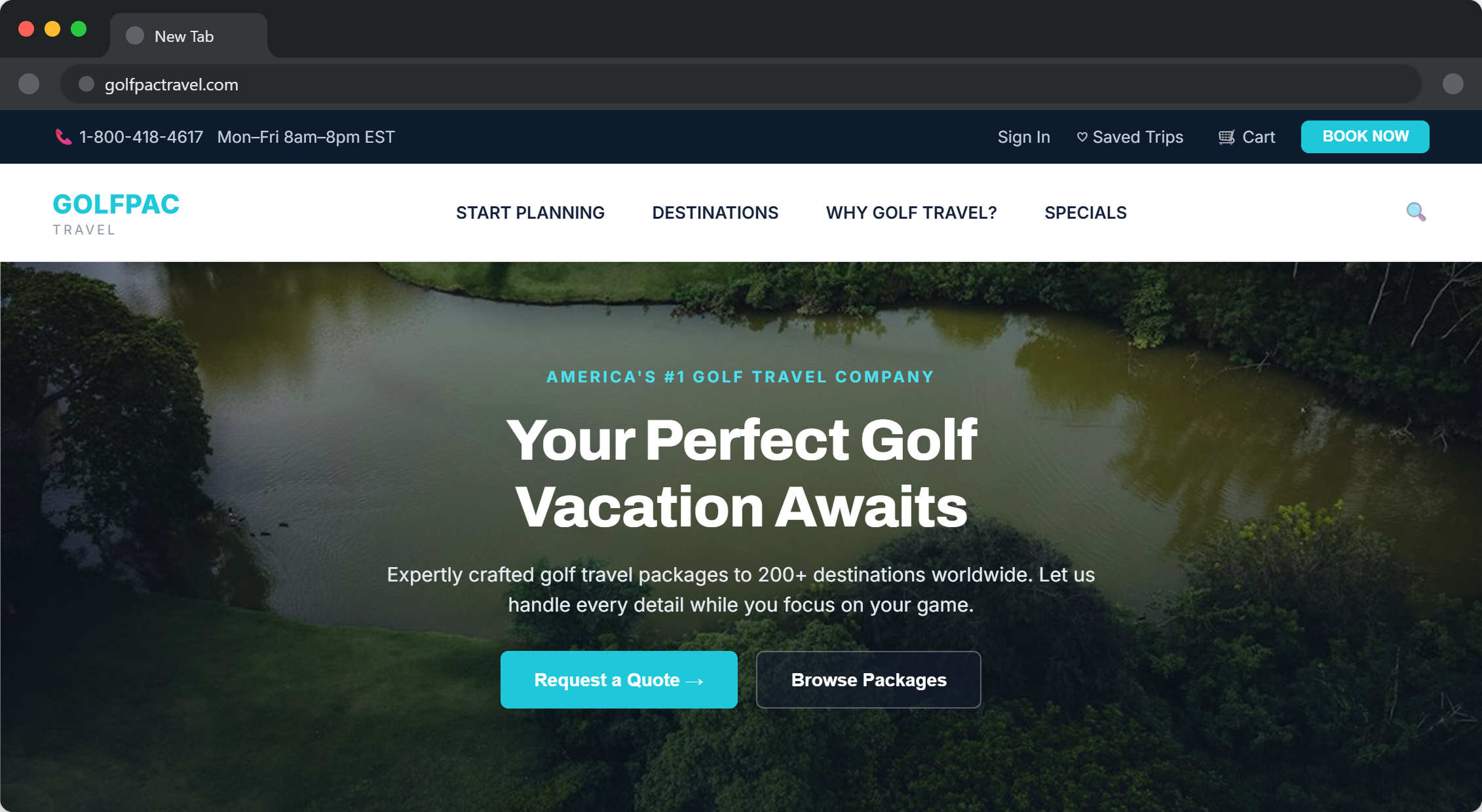
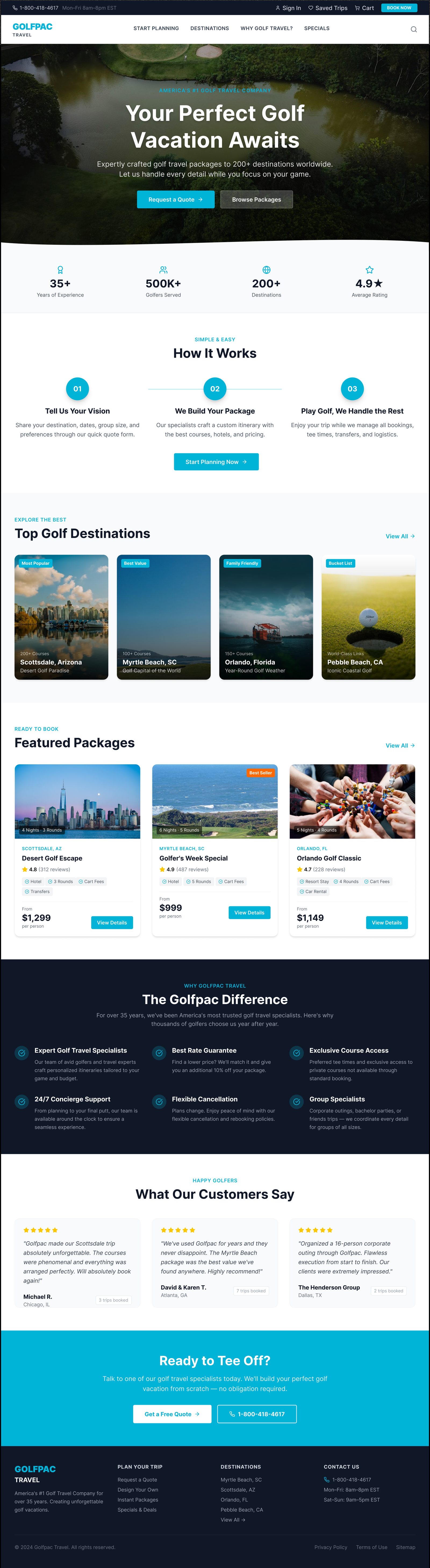
Screenshot of the live GolfPac Travel homepage, showing the hero headline "Your Perfect Golf Vacation Awaits" with Request a Quote and Browse Packages call-to-action buttons

✨ Overview

Project Snapshot

πŸ‘€ Role

Lead Product Designer & Frontend Developer

πŸ‘₯ Team

Solo Designer/Developer + GolfPac Stakeholder Team

πŸ“… Timeline

Aug 2024 – Sep 2025

πŸ’» Platform

Responsive Web (Desktop & Mobile)

πŸ›  Responsibilities

Research, UX, UI, AngularJS Implementation

πŸš€ Status

Shipped

Business Context

GolfPac Travel lets golfers book complete multi-day trips β€” golf rounds, lodging, and rental cars β€” across US destinations in one place. Its early-2000s look and feel no longer matched the scope of what it offered, and stakeholders had observed falling conversion rates as a result.

I owned the redesign end to end: research through wireframes, visual design, and the AngularJS implementation itself.

35+

Years in Business

500K+

Golfers Served

200+

Destinations

3

Planning Paths

My redesign focused on simplifying the last metric.

❗️ Disclaimer: Some visuals in this case study are wireframes and illustrative representations rather than final production screens.

✨ The Challenge

Problem Framing

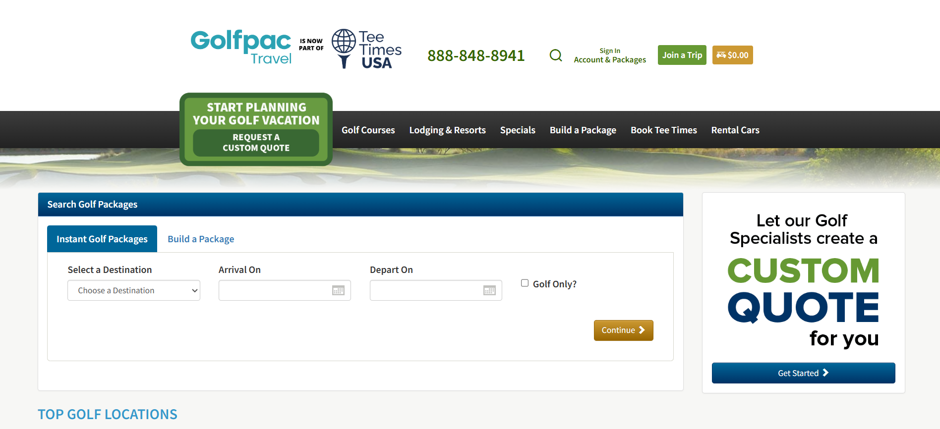
Compared to modern travel booking sites, GolfPac's existing experience felt dated and untrustworthy for what's a significant, considered purchase β€” golfers were being asked to commit to a multi-day, multi-part trip (golf, stay, transport) on a site that looked like it hadn't been touched in over a decade.

Business Problem User Problem
Falling conversions Too many competing CTAs
Outdated visual design Didn't trust the website
Booking flow spread across three disconnected paths Didn't know where to start
Before Original GolfPac Travel homepage before the redesign
After Redesigned GolfPac Travel homepage, high-fidelity design

Pinpointing Issues

  • Competing entry points: Three separate planning paths (Request a Quote, Design Your Own, Instant Packages) with no shared structure, leaving users unsure which to use.
  • Trust deficit: The outdated visual design undermined confidence for an expensive, considered purchase.
  • Scope mismatch: The site read like a basic tee-time booker, not a full trip-builder covering golf, lodging, and rental cars together.

Illustrative persona, built from stakeholder input rather than formal user interviews.

Michael R.

52 years, Frequent Golf Traveler

Decisive Value-conscious Time-pressed Loyal

"I want to book my trip in one sitting. If I have to guess which button starts the process, I've already lost trust in the company handling my vacation."

Goals

  • Compare multiple golf destinations quickly and confidently.
  • Get a transparent, all-in price before committing.
  • Book an entire multi-day trip without needing to call anyone.

Pain Points & Objections

  • Three different "start planning" buttons with no explanation of the difference.
  • Outdated design undermines trust for such a high-cost, considered purchase.

Expectations & Needs

  • A single, obvious way to start planning a trip.
  • Clear pricing shown upfront, not hidden behind a quote request.
  • A site that feels current and trustworthy for the money involved.

Ability to Use Technology

  • Comfortable booking travel online end-to-end.
  • Prefers self-service but expects a phone fallback to be available if something is unclear.
  • Low patience for multi-step forms with unclear progress.

πŸ—ΊοΈ The Journey

The end-to-end flow I designed the redesign around, and where the old site broke down along the way.

Discover β†’ Choose Destination β†’ Build Package β†’ Review β†’ Pay β†’ Confirmation

πŸ”΄ Pain Points (Before)

  • Too many competing entry points into the flow
  • No guidance on where to start
  • Low trust from an outdated visual design

🟒 The Solution (After)

  • A single, unambiguous path through the flow
  • Progressive, four-step checkout
  • Trust indicators at every stage

✨ The Solution

Our Goals

The goal was to design a flow that was familiar and linear β€” matching how people already book complex, multi-part trips elsewhere (Airbnb being the clearest reference point) β€” rather than asking users to compare multiple destinations' entire inventories at once.

High-Level Goals

  • One clear, unambiguous entry point instead of three competing paths
  • A modernized visual system that earns trust for a high-cost purchase
  • A structure that scales across golf, lodging, and rental car booking together
  • Wireframe-first process to validate flow logic before visual design

✨ Research & Discovery

Stakeholder Workshops β†’ Wireframes β†’ Heuristic Review β†’ Prototype β†’ Implementation

Stakeholder Workshops

Rather than formal customer research, my understanding of the problem came from structured stakeholder workshops with the GolfPac team throughout the design phase (Aug 2024 – Jan 2025). As an external freelancer without direct access to end users or analytics, this was the most reliable source of insight available to me: workshops surfaced which planning path caused the most confusion, what business rules constrained any redesign, and where internal teams disagreed β€” itself a useful signal about where the experience was genuinely ambiguous.

Why This Approach, Not User Interviews

I want to be upfront about this rather than imply a research process that didn't happen: I didn't conduct direct user interviews or formal usability studies on this project. The workshops gave me strong signal on business constraints and internal perception of the problem, but not direct end-user validation β€” which is exactly why the "What I'd Improve" reflection below calls out pushing harder for analytics access next time.

πŸ“Š Competitor Analysis

Informal reference points I used to ground the redesign in proven travel-booking patterns, not a formal competitive study.

Airbnb Booking.com Existing GolfPac Travel
Progressive, single-listing booking Progressive, single-listing booking Three separate, competing CTAs
Large, real photography Large, real photography Text-heavy, minimal imagery
One destination at a time One destination at a time Multi-destination comparison

Our redesign adopted these proven travel-booking patterns rather than inventing a new interaction model.

✨ Usability Heuristics

Without formal user testing rounds, I evaluated design decisions against established usability heuristics rather than live user data:

  • Visibility of system status β€” the four-step checkout (Traveler β†’ Review β†’ Payment β†’ Confirm) keeps users oriented on exactly where they are in a longer process.
  • Recognition over recall β€” the "Design Your Own" builder shows real course and lodging photography rather than requiring users to remember or look up options from a plain list.
  • Consistency and standards β€” the redesign matches the linear, single-destination booking pattern used across mainstream travel sites (the Airbnb reference point), rather than introducing a novel interaction pattern GolfPac's users would need to learn.
  • Error prevention β€” resolved directly in the checkbox-vs-linear decision: a linear flow structurally prevents the confusion of comparing incompatible multi-destination inventories at once.

This is a real evaluation method, just not a substitute for actual user testing β€” worth being clear that these heuristics informed design decisions, they didn't validate them against real behavior.

✨ Design Process

Information Architecture

Homepage β†’ Destination β†’ Packages β†’ Traveler Details β†’ Payment β†’ Confirmation

Design Principles

  • Reduce decisions
  • Increase trust
  • Match mental models
  • Keep booking linear
  • Surface pricing early

Wireframes First

I mapped the full experience in structural black-and-white wireframes before any visual design began, locking the flow logic first: entry and account screens, the three planning paths, supporting content (Destinations, Specials, Why Golf Travel, Saved Trips), and the checkout flow.
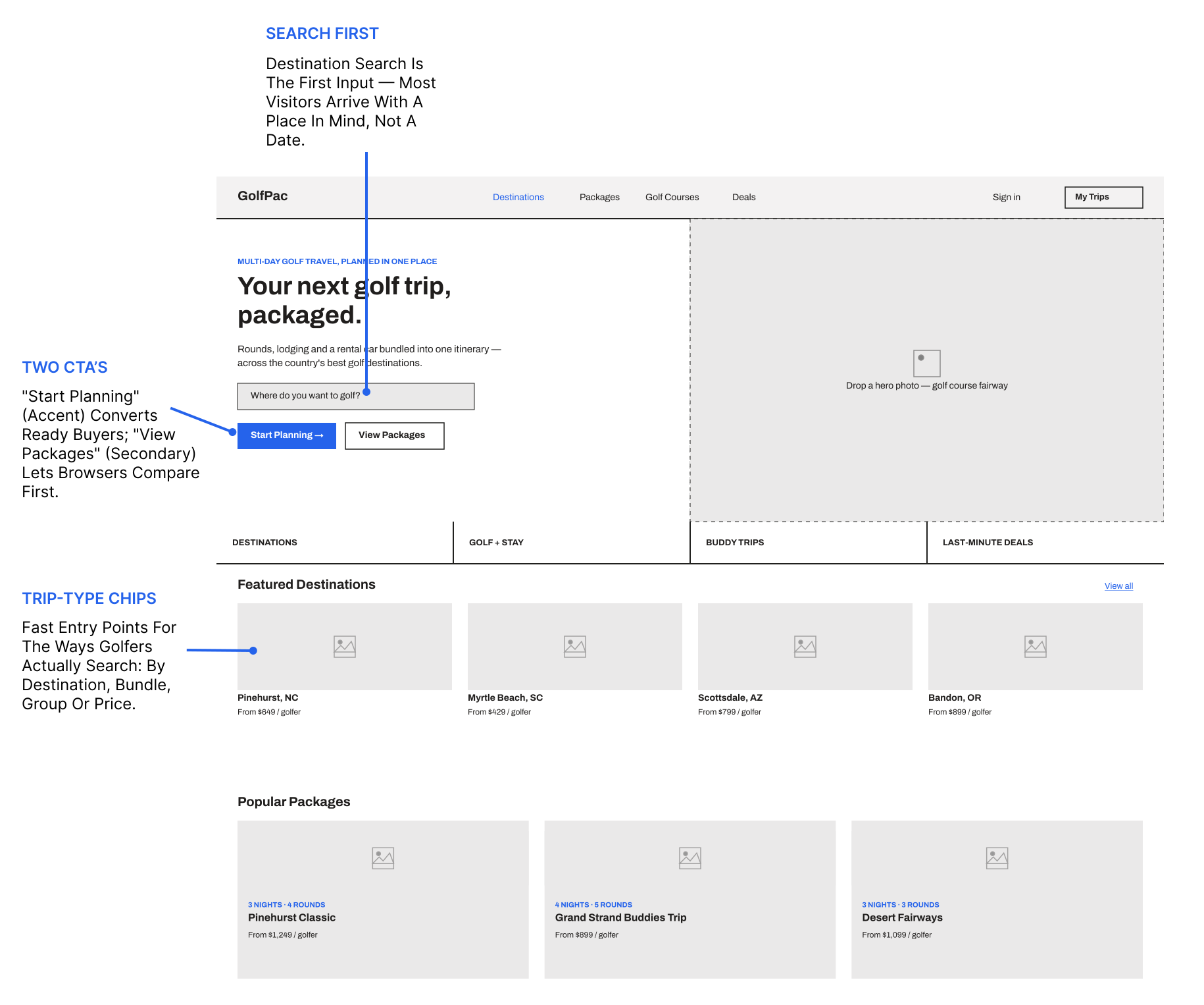
Annotated wireframe of the GolfPac Travel home page, calling out destination-first search, the two-CTA hierarchy, and trip-type entry chips

Decision Matrix: Destination Selection

Stakeholders initially wanted the Destinations page to support multi-select checkboxes, letting users tick several locations and search across all of them at once. Rather than push back with an opinion alone, I built out concrete scenarios comparing that against a linear, single-destination flow to make the trade-off tangible.

Option Pros Cons Decision
Multi-select More flexible for comparison shoppers Compounds the existing decision-paralysis problem ❌
Single destination Simple, matches how people already book trips like this Less flexible for cross-destination comparison βœ…

The team agreed to keep destination selection linear.

✨ Key Features

  • Findability: A single, unambiguous entry point (segmented tabs: Request a Quote / Design Your Own / Instant Packages) replacing three disconnected paths.
  • Linear Destination Selection: One destination at a time, matching how users already book complex trips elsewhere.
  • Progressive Checkout: A four-step flow (Traveler β†’ Review β†’ Payment β†’ Confirm) breaking a dense form into a clear, trackable sequence.
  • Trust-Building Visual System: Real photography, a modern cyan-accented brand system, and reassurance microcopy at the exact moment checkout hesitation would occur.
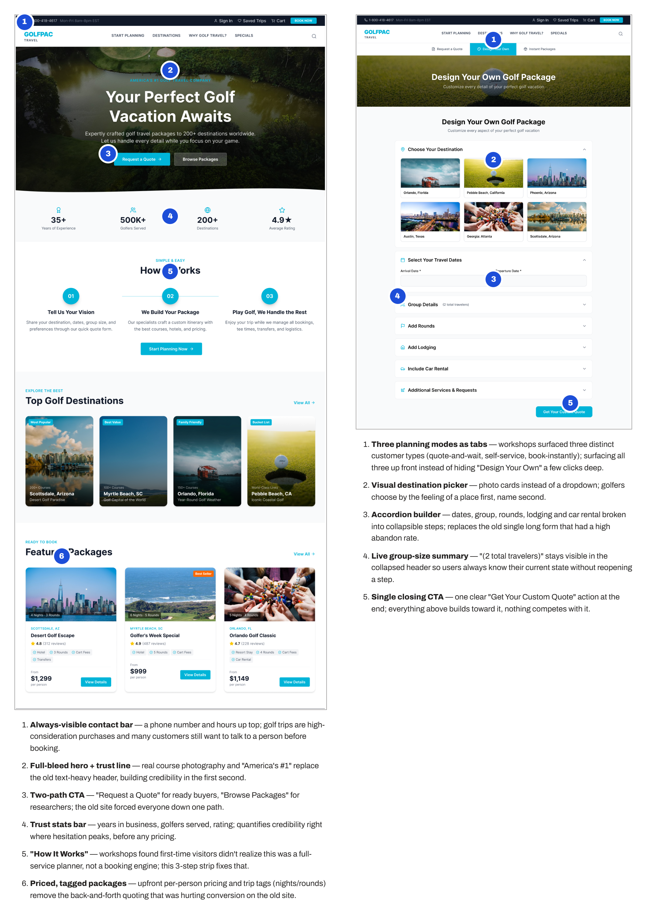
Annotated GolfPac Travel Home and Design Your Own screens side by side, calling out the always-visible contact bar, full-bleed hero with trust line, two-path CTA, trust stats bar, How It Works strip, priced package cards, planning-mode tabs, visual destination picker, accordion builder, live group-size summary, and single closing CTA

✨ Final Designs

With structure validated, I moved to full visual design β€” establishing GolfPac's brand identity (cyan accent, clean white surfaces, real course and destination photography) across the complete experience.
GolfPac Travel home page, high-fidelity design
Home Single clear CTA against real course photography, a trust bar (35+ years, 500K+ golfers, 200+ destinations, 4.9β˜…), and a three-step "How It Works" explainer.
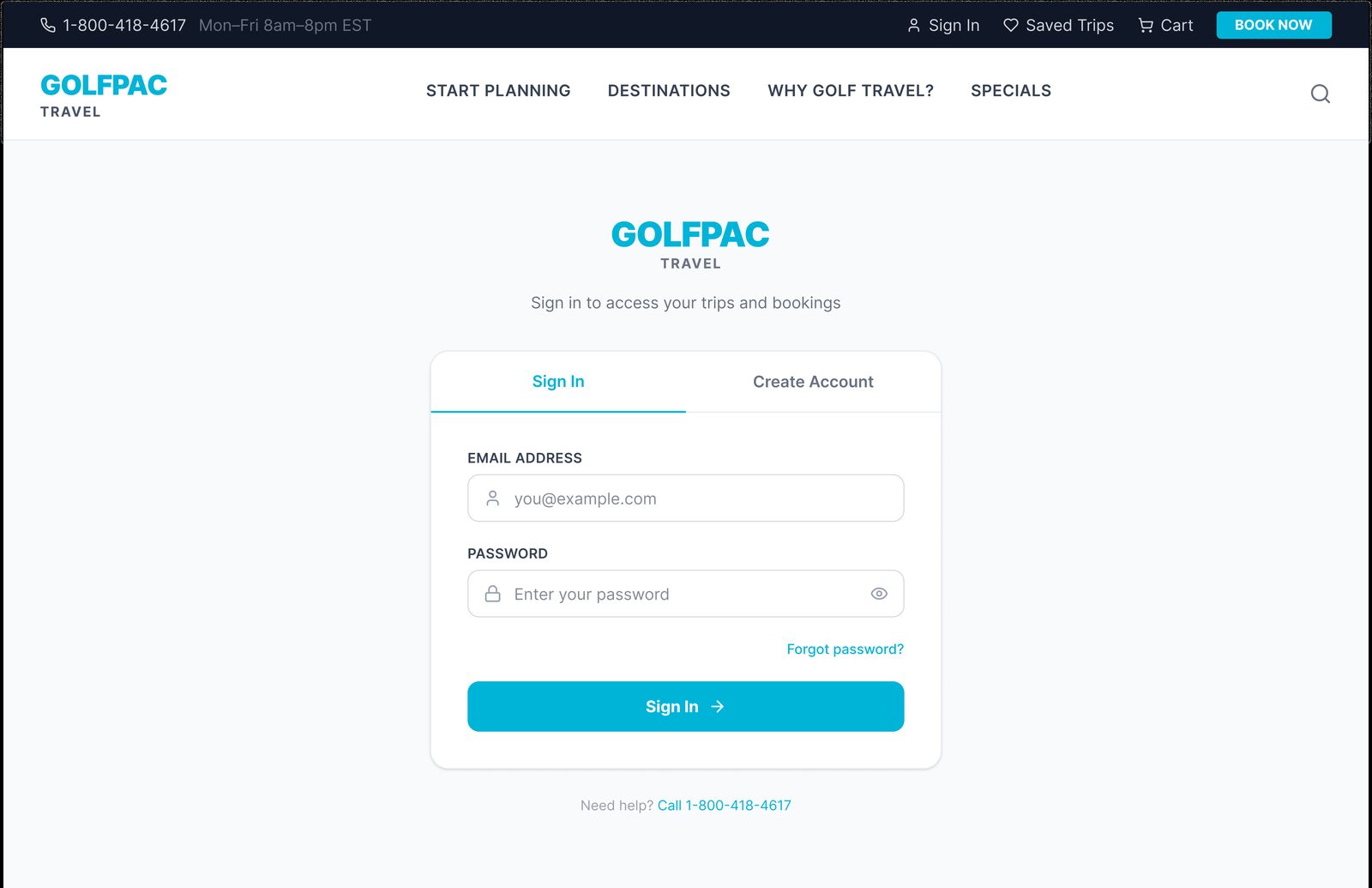
GolfPac Travel sign in tab, high-fidelity design
Sign In A single tabbed component rather than separate pages, so switching doesn't cost a page load.
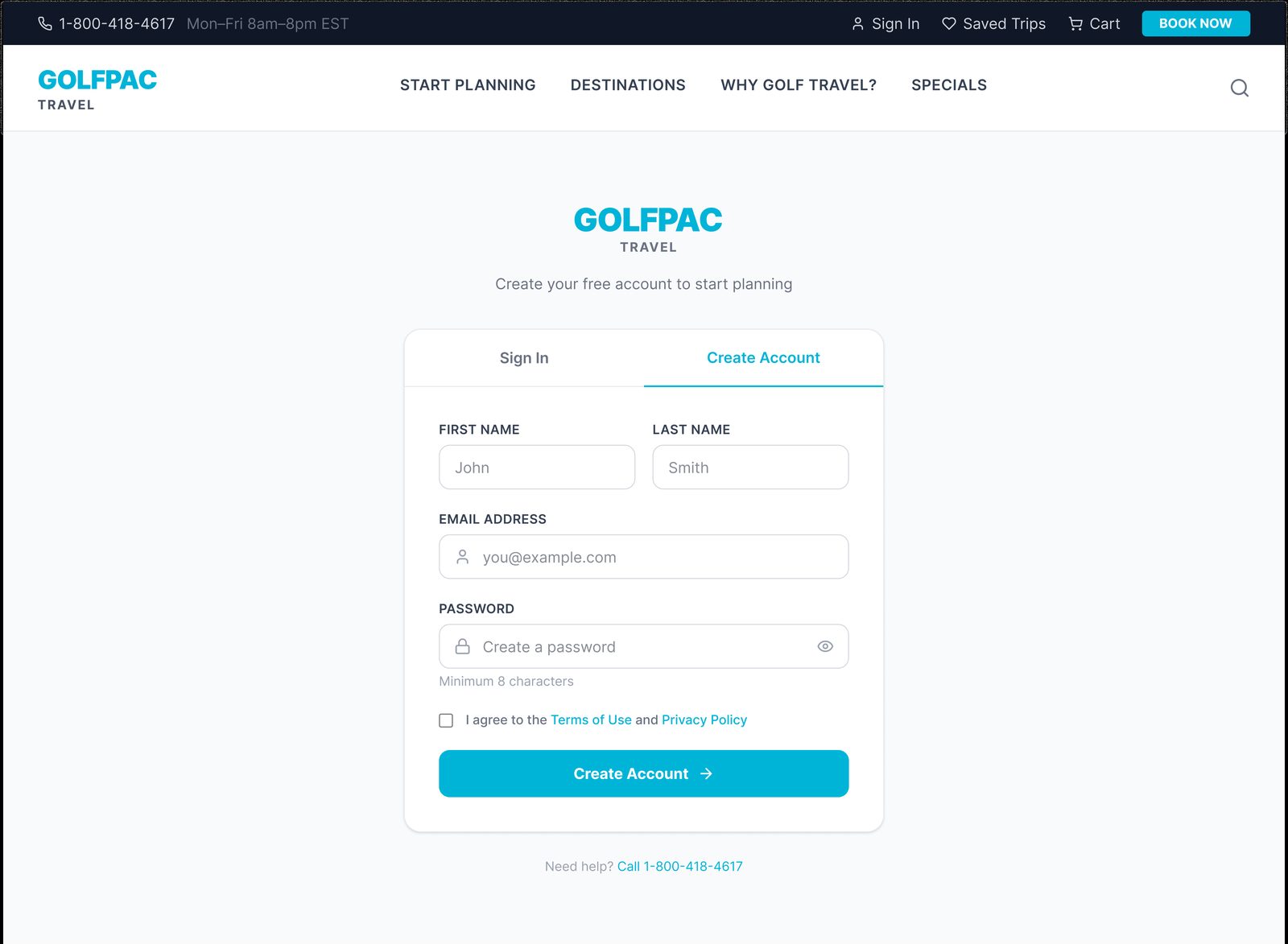
GolfPac Travel create account tab, high-fidelity design
Create Account Password requirements stated upfront; consent is a simple inline checkbox rather than a wall of legal text.
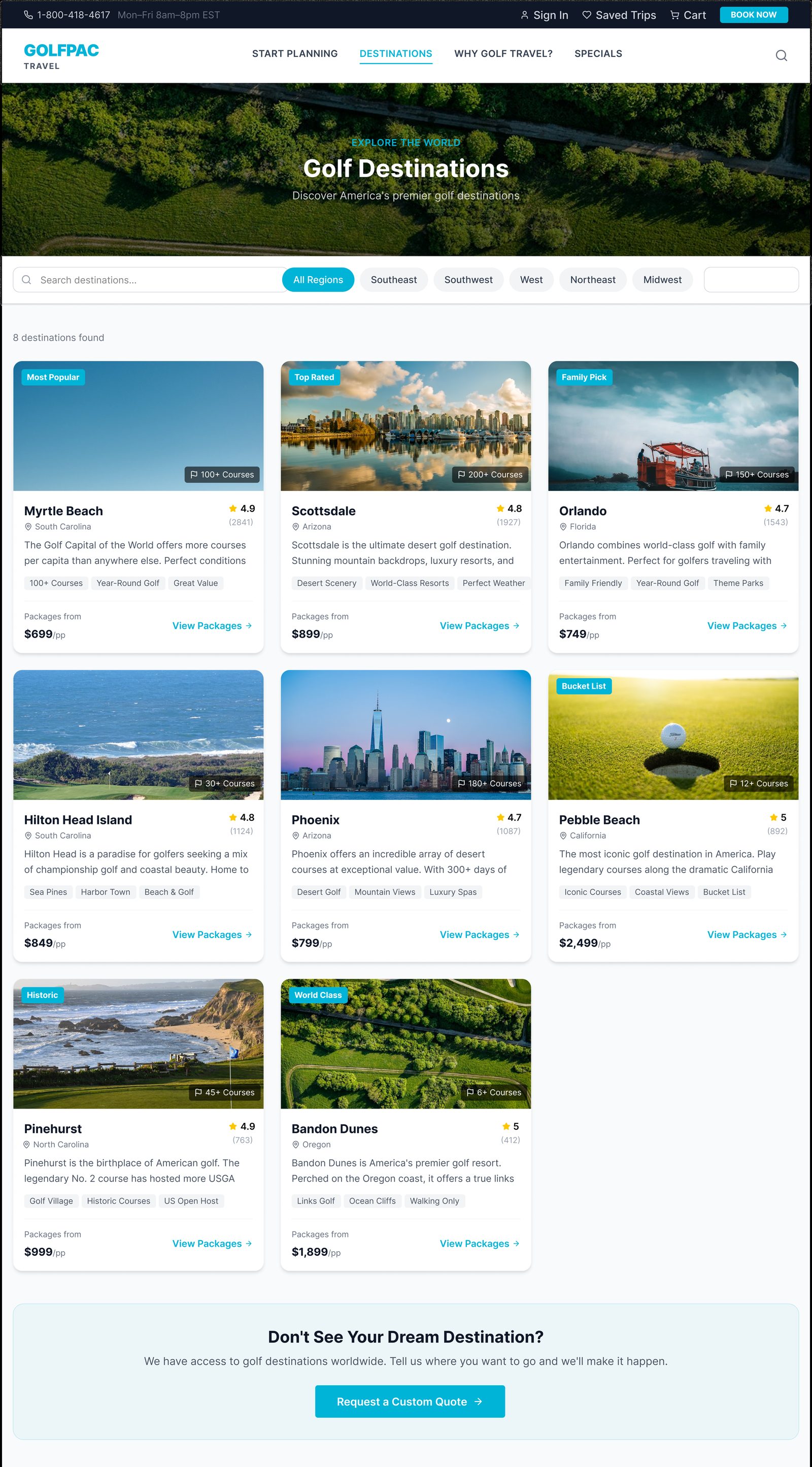
GolfPac Travel destinations page, high-fidelity design
Destinations Each card shows a status badge, rating, review count, and starting price. A fallback CTA ("Don't See Your Dream Destination?") routes unlisted requests to a custom quote instead of a dead end.
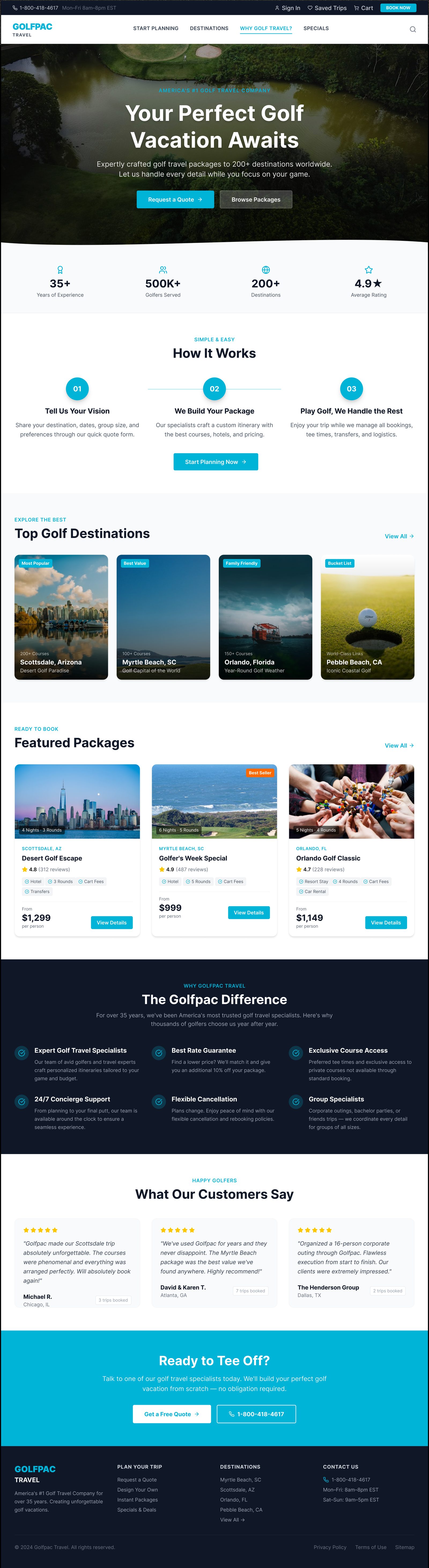
GolfPac Travel Why Golf Travel page, high-fidelity design
Why Golf Travel? A dedicated trust-building page for shoppers who aren't ready to commit to a destination yet.
GolfPac Travel specials page, high-fidelity design
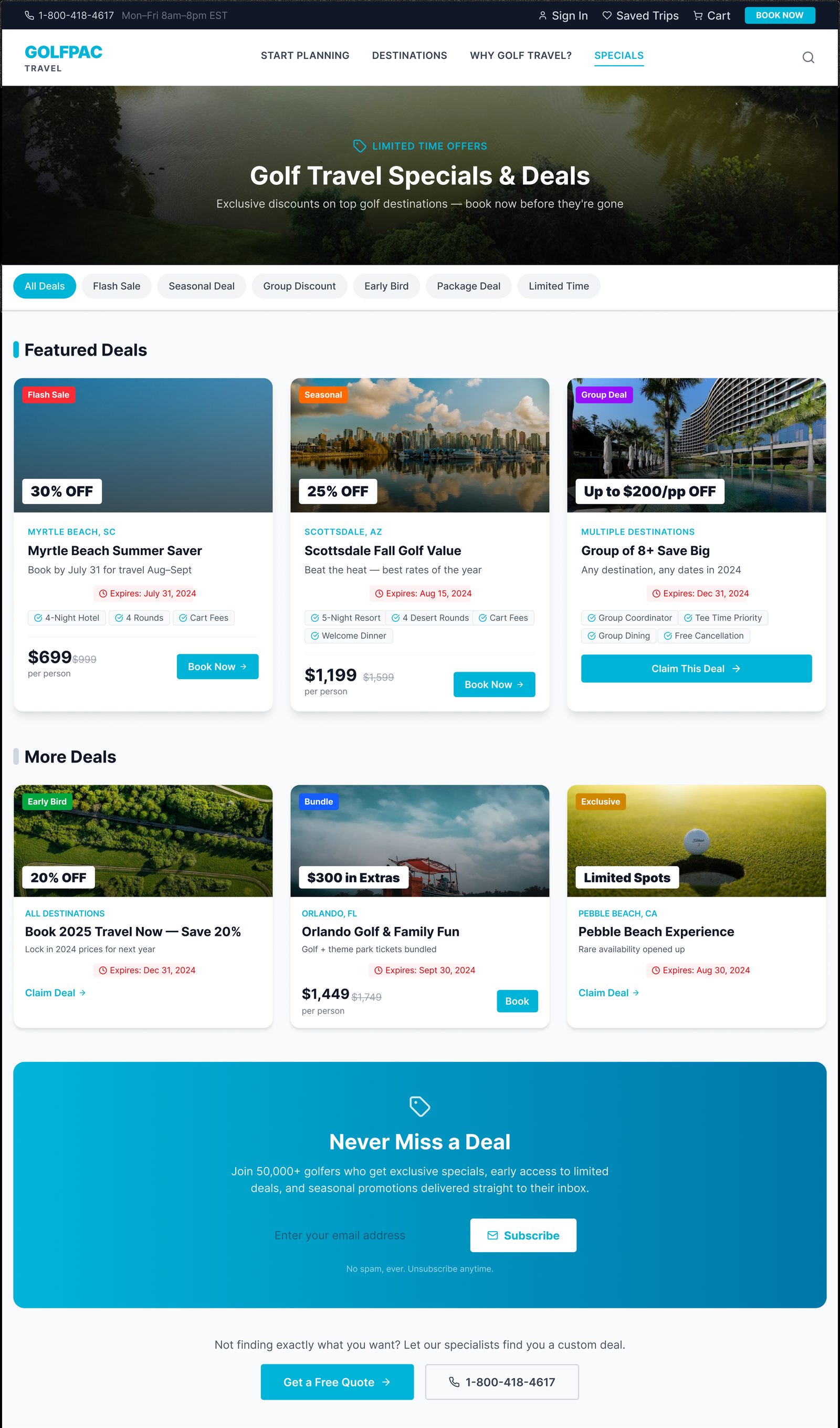
Specials Expiring-deal dates and percentage-off badges, without countdown-timer pressure tactics. Category filters narrow by deal type; a newsletter capture converts "not ready to book" visitors into future leads.
GolfPac Travel design your own package page, high-fidelity design
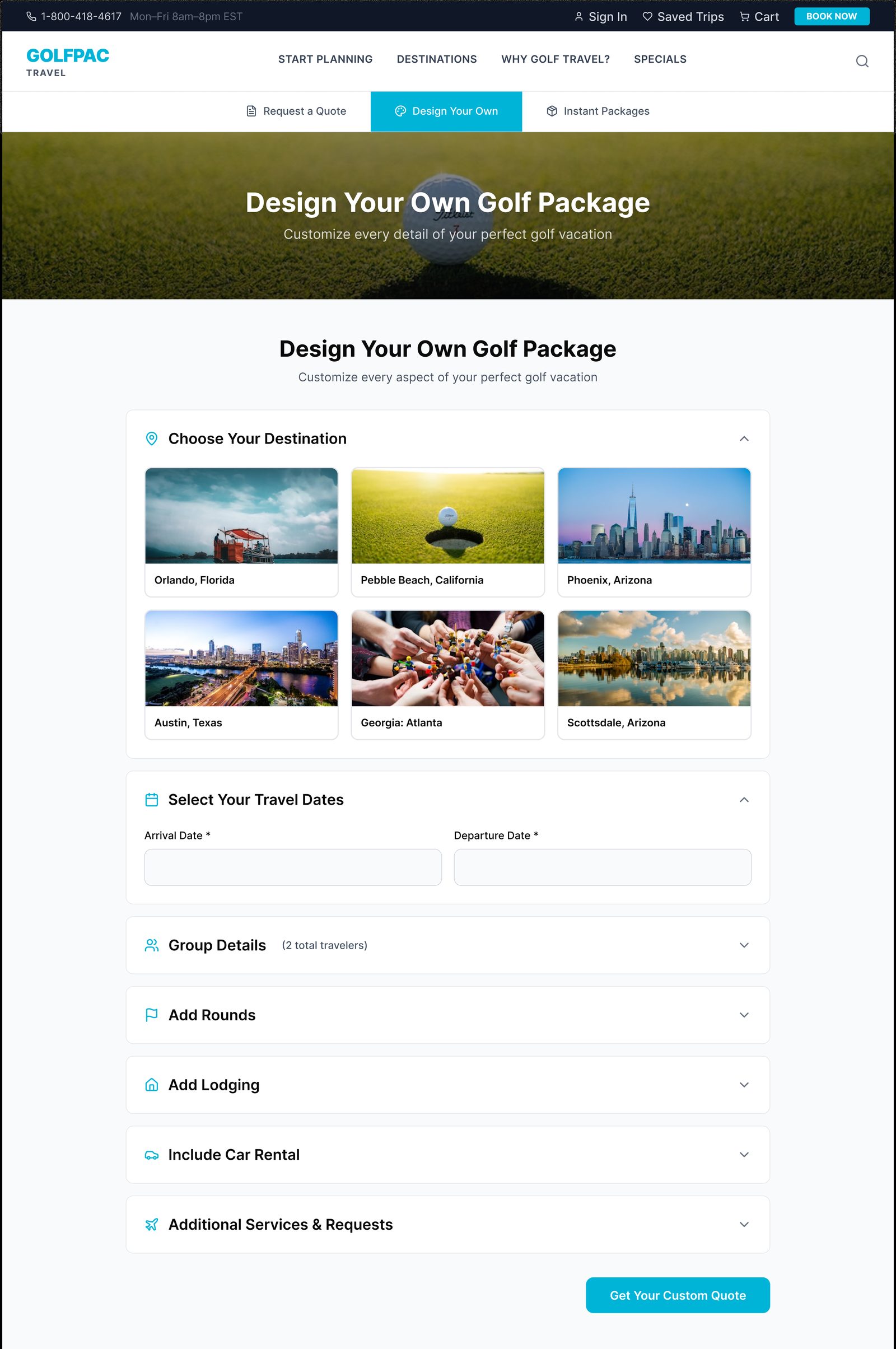
Design Your Own Real destination photography replaces plain dropdowns; the builder is broken into collapsible sections (Group Details, Add Rounds, Add Lodging, Car Rental, Additional Services) so users focus on one decision at a time.
GolfPac Travel instant packages page, high-fidelity design
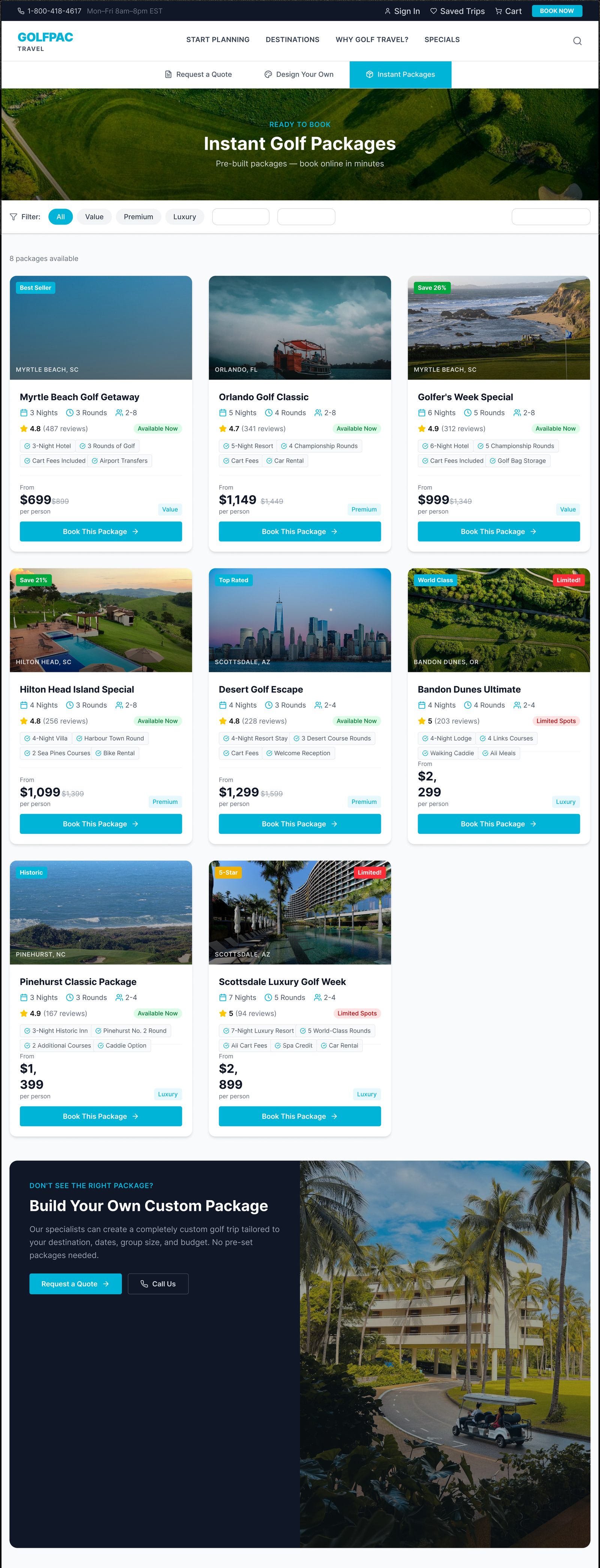
Instant Packages Value/Premium/Luxury filter chips help users self-segment; strikethrough pricing makes savings explicit; status badges add urgency without separate marketing banners. The same "Build Your Own" fallback appears here too.
GolfPac Travel request a quote page, high-fidelity design
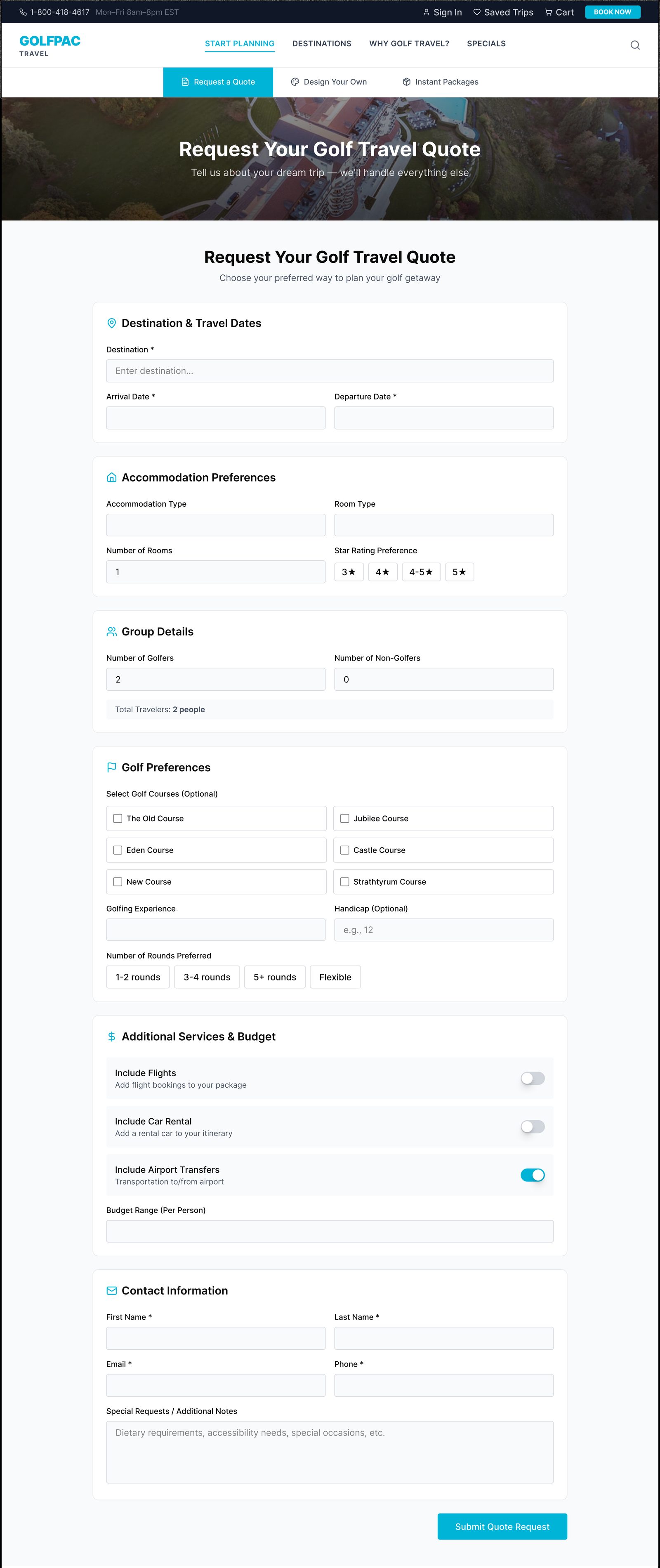
Request a Quote The most form-heavy path, and the clearest example of progressive disclosure: Destination & Dates, Accommodation, Group Details, Golf Preferences, and Additional Services each get their own visually distinct card.
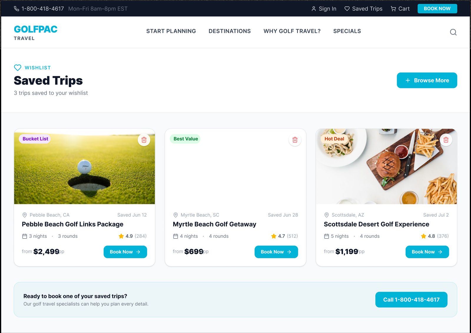
GolfPac Travel saved trips page, high-fidelity design
Saved Trips A lightweight wishlist showing when each trip was saved, with a direct "Book Now" path and phone fallback for returning users.
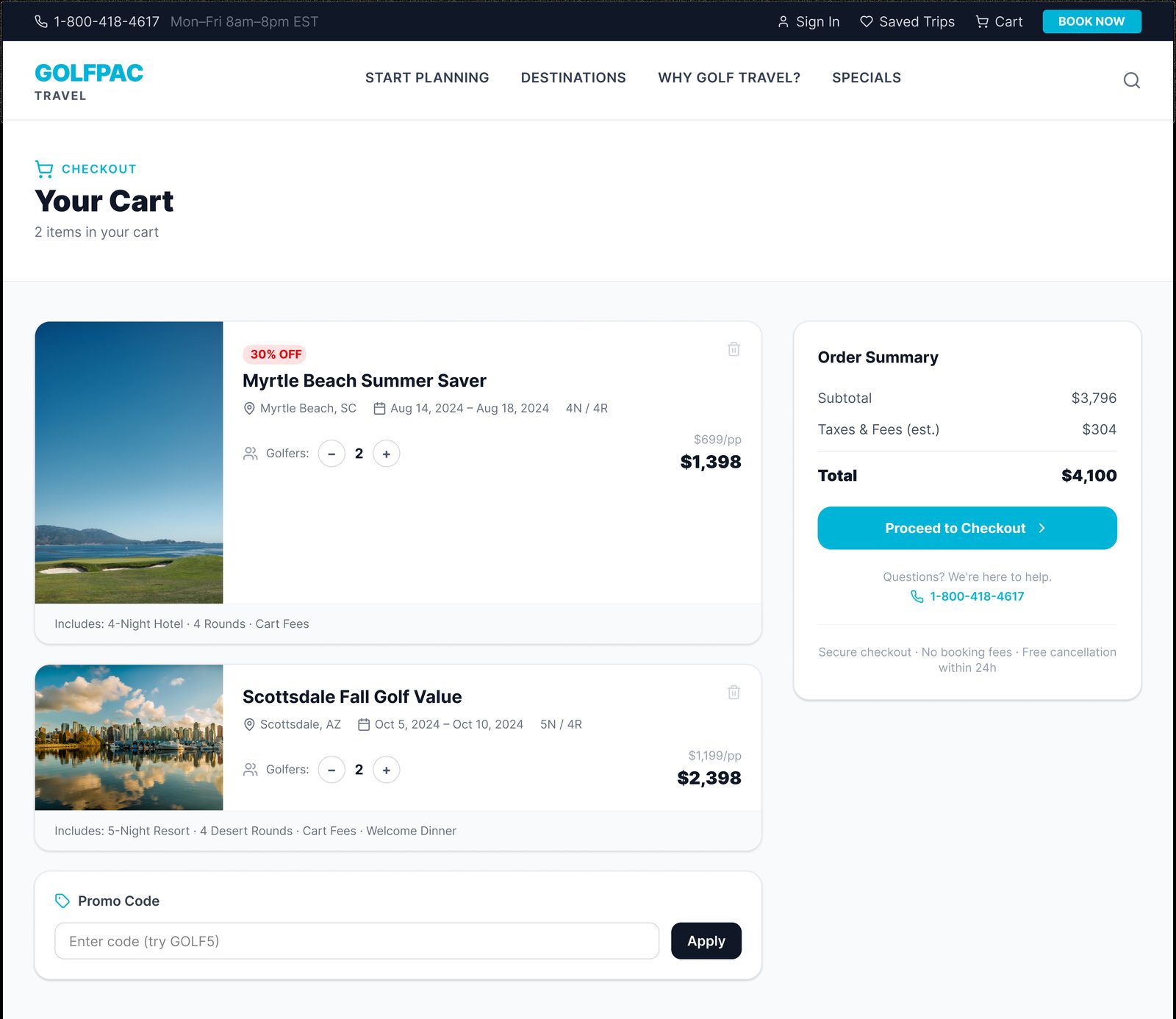
GolfPac Travel cart page, high-fidelity design
Your Cart Cart items and order summary side by side, with adjustable golfer counts and transparent price recalculation. Reassurance microcopy sits directly above the CTA, addressing checkout hesitation at the exact moment it would cause drop-off.

✨ Developer Handoff

Figma Component β†’ Angular Component β†’ Reusable Module β†’ Production

Unlike a typical design-to-engineering handoff, there was no translation gap on this project β€” I designed and built it myself in AngularJS, which changed how the work actually happened:

  • Design decisions were made with implementation cost already in view. When I explored the Destinations page layout, I already knew what restructuring the underlying AngularJS controllers would require β€” so trade-offs between "ideal" and "buildable" happened in the same pass, not as a negotiation between a designer and a separate engineering team afterward.
  • The component system doubled as both a design system and a codebase. Reusable UI patterns (cards, filter chips, step trackers) were built once as both a visual standard and an actual Angular component, rather than a Figma library that engineering had to reinterpret.
  • Iteration was faster because there was no handoff queue. A design change didn't wait for a sprint planning cycle to reach an engineer β€” I could validate a design decision by actually building it and seeing how it held up with real content and real interaction, then adjust immediately.
  • I restructured existing AngularJS controllers directly as part of the frontend modernization work, improving maintainability alongside the visual and UX changes β€” meaning the redesign wasn't just skin-deep, it touched the underlying code structure too.

The trade-off worth naming honestly: working solo across both roles meant I didn't have a second engineer's perspective checking my technical decisions the way a real design-engineering pairing would β€” something worth being aware of as a limitation of the solo-freelance structure, even though the tight design-build loop was a genuine advantage.

✨ Reflections

What Worked

  • Constraints sharpen decisions β€” advocating for a linear flow meant building real scenarios, not just asserting an opinion.
  • Design and development together, not in sequence β€” owning both roles meant technical feasibility shaped design decisions from day one.
  • Simple beats powerful β€” more options for users doesn't always mean an easier decision.

What I'd Improve

  • Push harder for direct end-user interviews instead of relying solely on stakeholder workshops.
  • Get analytics access earlier to validate decisions against real behavior, not just heuristics.

What I'd Measure

  • Completion rate through the new linear flow.
  • Quote requests generated.
  • Time to checkout.
  • Drop-off rate at each step.

Impact

  • Shipped
  • Modernized UI
  • Simplified booking
  • Reduced ambiguity
  • AngularJS implementation completed
  • Positive stakeholder validation

If analytics become available, I'd measure:

Completion Rate β†’ Quote Requests β†’ Time to Checkout β†’ Drop-off Rate