Centralizing multi-hotel room service into one cloud-kitchen network with a single source of pricing control
tasteX is a QR-based room-service ordering system built for a cloud kitchen
operation serving multiple hotels within a city. Rather than each hotel running its
own in-house kitchen, a single central kitchen fulfills room-service orders across
several partner hotels — guests order by scanning a QR code in their room, and the
order is routed to whichever kitchen is mapped to that property.
Role: Product & UX DesignerDuration: Jan 2026 – May 2026Client: Cloud-kitchen operator (multi-hotel room service)
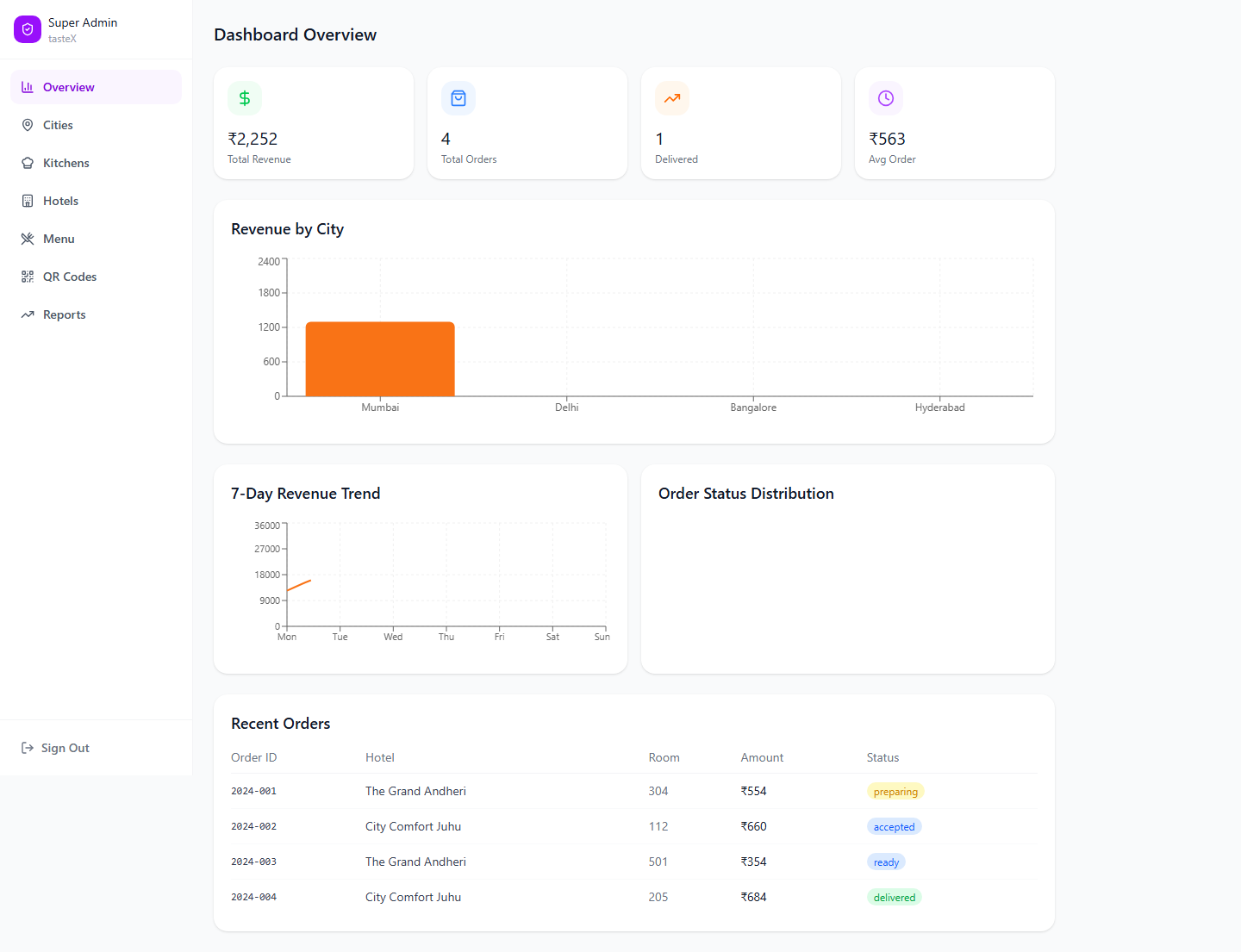
admin.tastex.app/dashboard
I designed the full system end-to-end: the guest ordering experience, the kitchen
staff's order-management dashboard, and the super-admin panel that runs the whole
operation across cities, kitchens, hotels, and menus — along with the brand and
design system tying all three together.
🧭 Problem
A cloud kitchen operation serving multiple hotels within a city needed a way to route room-service orders from many properties into one central kitchen — without guests, kitchen staff, or the business losing track of who was ordering what, or how it was being fulfilled.
💡 Solution
Designed a three-portal system — a QR-based guest ordering flow, a kitchen staff kanban dashboard, and a super-admin control panel — unified under one shared design system.
📊 Impact
Deployed in UAT; stakeholder feedback highlighted clearer order visibility for kitchen staff, improved operational reporting for admins, and simplified QR-based guest ordering with no room/hotel confusion.
02 🧭 Problem
Boutique and mid-size hotels couldn't justify a full in-house kitchen —
but guests still expected room service.
What the system had to reconcile
No affordable way for boutique and mid-size hotels to run their own in-house room-service kitchen
One central kitchen needed to reliably serve multiple hotels in the same city
Guests should never need to know or care which kitchen was actually cooking their food
Kitchen staff needed a simple way to manage incoming orders without training overhead
The business needed one central point of control over pricing, menus, and reporting across every city it operated in
The product needed to work for three completely different users, each with
different devices and different concerns — a hotel guest ordering from their room,
kitchen staff managing a live queue, and a super admin running the operation across
cities. That split is what shaped the rest of the system.
03 🧩 Portals
Three portals, one system.
Portal
Device
User
Core job
Guest
Mobile-first (375px+)
Hotel guests
Order food from their room
Kitchen
Desktop (1024px+)
Kitchen staff
Accept, prepare, and fulfill orders
Admin
Desktop (1280px+)
Super admin
Manage cities, kitchens, hotels, menus, pricing, and reporting
Guest flow, at a glance.
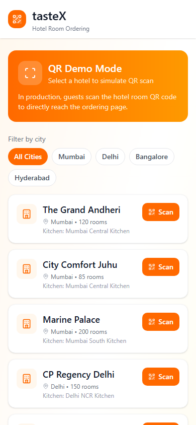
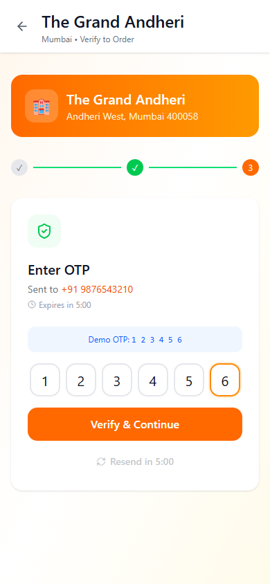
📷 Scan→🔐 Verify→🍽️ Browse→💳 Pay→📦 Track
The guest experience is deliberately linear, with no back-tracking once
verification starts: a QR scan (with a manual hotel-and-room-number fallback for
when scanning fails), OTP verification re-checked every session since no login
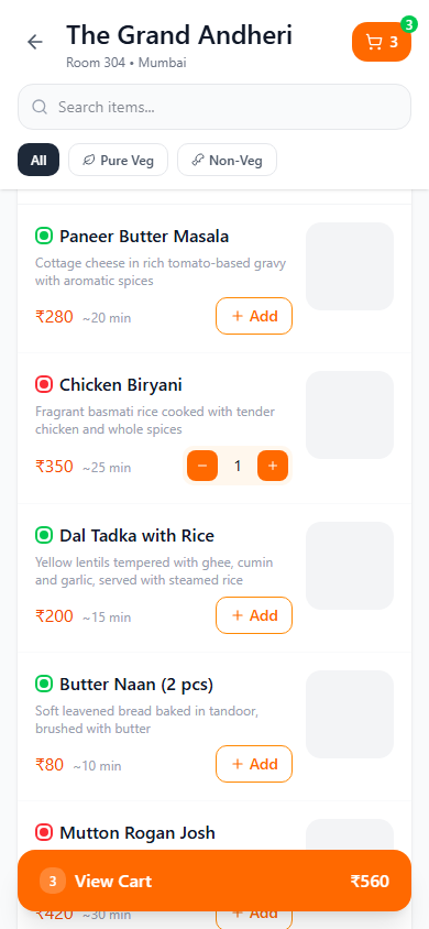
persists between visits, a menu filtered by veg/non-veg and organized into
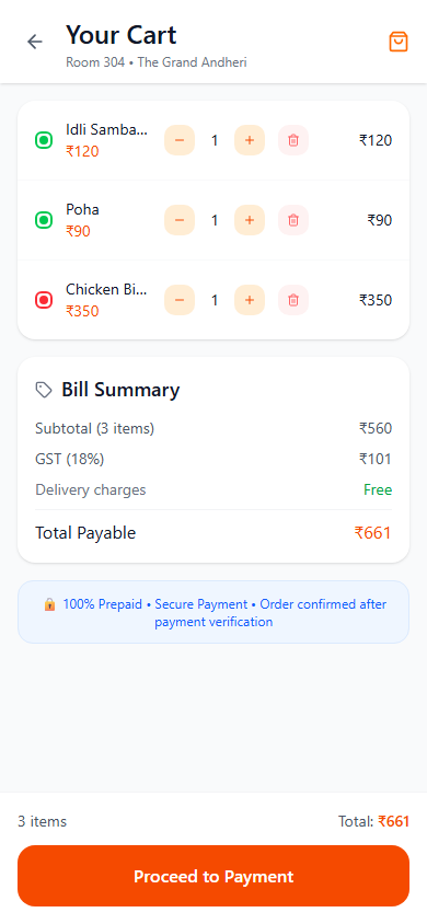
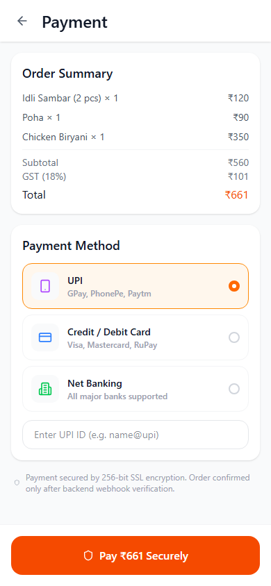
categories, a prepaid-only cart with a full GST breakdown, and a confirmation screen
where the order ID, estimated time, and kitchen routing are handled invisibly in the
background.
I carried this through two fidelity stages — structural wireframes to lock the flow
logic first, then this fully-branded high-fidelity build in orange, with realistic
menu content, live-feeling payment states ("Processing Payment," "Verifying
Payment"), and a working demo mode that simulates the QR scan for testing without
needing a real hotel room.
1. QR scanDemo mode simulates scanning a room's QR code
2. OTP verifyRe-verified every session, no persistent login
3. Browse menuFiltered by veg/non-veg, grouped by category
4. CartFull price breakdown with GST, prepaid only
5. PayUPI, card, or net banking — no cash on delivery
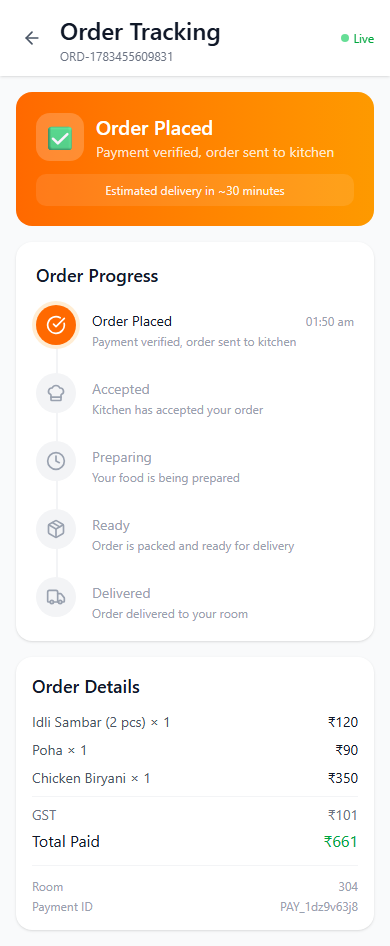
6. Confirm & trackOrder ID, ETA, and a live status timeline
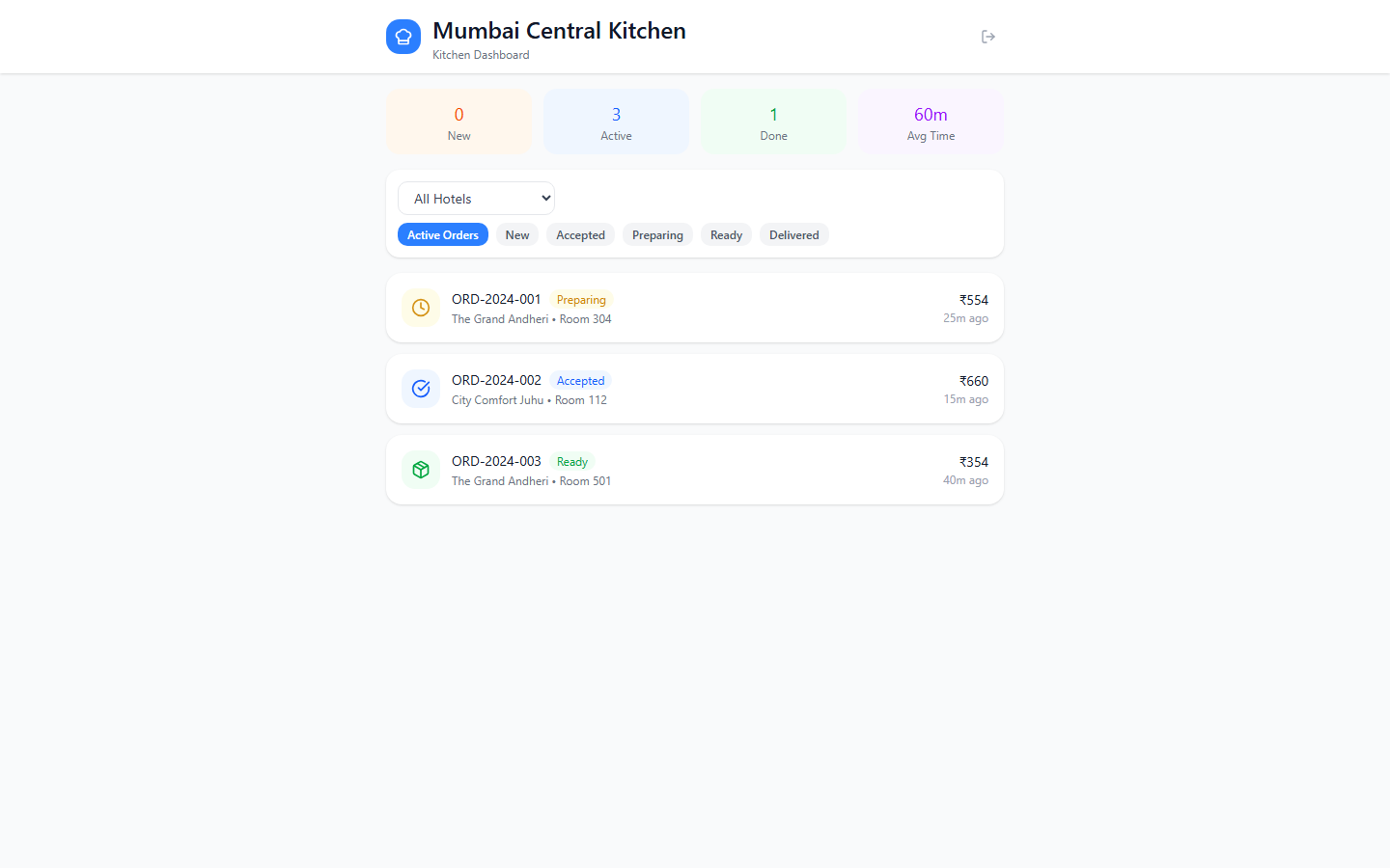
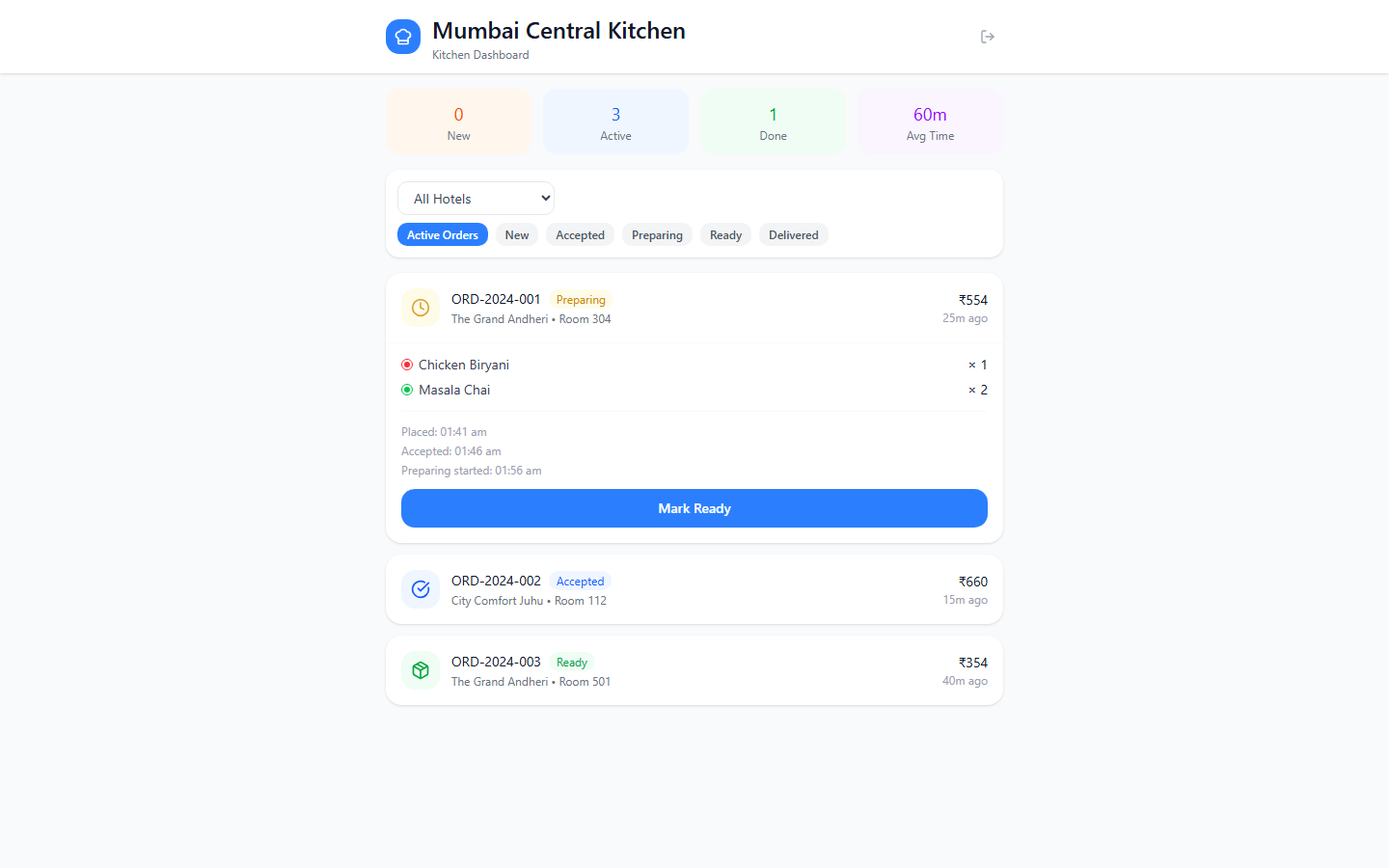
Kitchen flow: a status-driven queue kitchen staff can glance at between orders.
Kitchen staff needed something they could check between orders, not a dashboard
requiring training. The screen leads with at-a-glance counts — New, Active, Done,
and average service time — then a filterable order list: all hotels or one, and
every stage from New through Delivered. Each order expands to show its items and a
single action button that advances it to the next stage — Accept, Start Preparing,
Mark Ready, Mark Delivered — so staff never have to guess what to do next. A live
"new orders" badge in the header calls out anything unaccepted. Deliberately absent:
pricing or revenue figures. Kitchen staff see what they need to cook and route,
nothing else.
Active-orders view, filtered by hotel and status
Expanded order: items, timeline, and the next-stage action
Admin: central control, without local overrides.
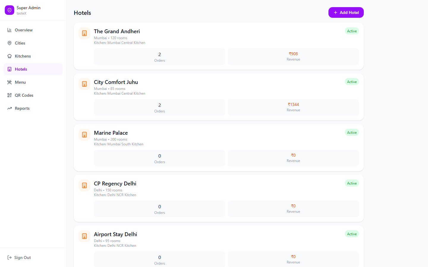
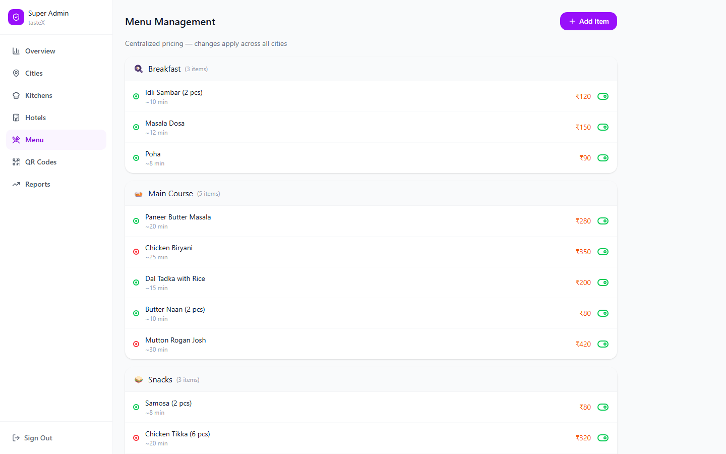
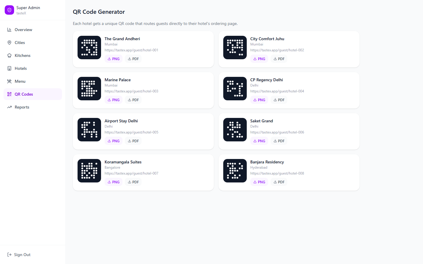
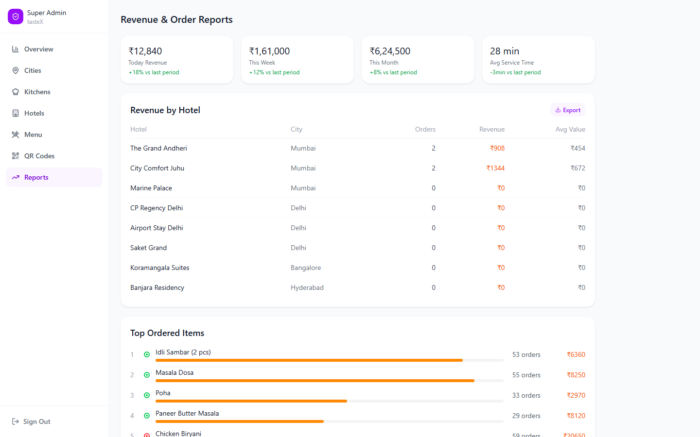
The admin panel is the operational backbone: a six-tab structure — Cities, Kitchens,
Hotels, Menu, QR Codes, Reports — sitting under one hard rule: pricing is centrally
controlled and propagates to every city, so no single hotel or kitchen can quietly
override a price. Hotels map to exactly one kitchen each, which prevents the
ambiguity of an order being split across two kitchens. QR codes are generated and
managed per hotel, with PNG and PDF export for printing.
Hotels — each mapped to exactly one kitchen
Menu — centralized pricing, changes apply across every city
QR Codes — one per hotel, exportable as PNG or PDF
Reports — revenue by hotel and top-ordered items
04 🎨 Design System
One design system underneath three portals.
Rather than design three portals as separate products, I built a shared design
system underneath all of them.
Brand
Name treated strictly as "tasteX" (never TasteX or Tastex), tagline "Room to Order." — direct, warm, reliable, efficient by design intent.
Color
A deliberate accent color — orange — reserved for all primary actions and prices, plus semantic colors for status (green/yellow/red for order states) and a distinct accent reserved specifically for the admin portal, to visually separate "operator" surfaces from guest-facing ones.
Typography
Plus Jakarta Sans for display/headings, Inter for body and UI — a paired system rather than a single font doing every job.
Spacing
A 4px base-unit scale, applied consistently from icon gaps up to page-section margins.
Components
A documented library of buttons, form fields, badges, cards, and a dedicated OTP input component, so all three portals stayed visually and behaviorally consistent.
PrimaryReadyPreparingNon-vegAdminKitchen
Encoding the rules into the design.
Because this system runs on a few non-negotiable business rules, I documented them
explicitly as design principles alongside a "don't" list. Treating these as
first-class design constraints — not just backend rules — meant the UI itself made
the wrong actions structurally unavailable, rather than relying on staff to remember
not to break them.
No exposing kitchen identity or revenue data to the wrong role
Live Prototype
Explore the full guest ordering flow
The interactive prototype below is walkable end to end — QR scan through order
confirmation — in the same Figma file used to validate the flow.
This file predates the tasteX rebrand, so its in-app header and admin sidebar
still read "RoomServe" — the flows and screens themselves are otherwise current.
Simplicity for one user often meant complexity somewhere else.
Building a shared platform meant making a series of product decisions where
simplicity for one user often increased complexity somewhere else. These decisions
shaped the final product more than the UI itself.
Design Constraints
Hotels cannot override pricing
One hotel maps to exactly one kitchen
No cash-on-delivery
QR codes must uniquely identify both hotel and room
Staff should be able to learn the interface with no formal training
Guest ordering should require no training
Admin changes must propagate across every city
Decision 1
Local pricing vs. centralized pricing
Initial idea
Allow every hotel to maintain its own menu and pricing. Sounds flexible — but once
multiple hotels shared the same kitchen, pricing quickly became inconsistent. Two
hotels could sell the same dish at different prices, creating operational confusion
and making centralized reporting unreliable.
What changed
Instead of local ownership, pricing became centrally managed. Hotels inherit menus
from the central system rather than editing them independently.
Outcome
Consistent guest experience
Reliable reporting
Easier operations
Decision 2
Should guests know which kitchen prepares their food?
Initial idea
Initially, we considered exposing the assigned kitchen to improve transparency.
During workflow mapping, it became clear that guests weren't interested in the
operational structure — they simply wanted their food delivered to the correct room.
Showing kitchen information would only introduce unnecessary complexity.
Final decision
Guests interact only with the hotel. Kitchen routing happens entirely behind the
scenes.
Outcome
Cleaner experience
Lower cognitive load
Hotels maintain ownership of the guest relationship
Decision 3
Persistent login vs. OTP every session
Initial idea
The first idea was a traditional guest login. However, hotel room occupancy changes
frequently — a persistent session could allow the next guest occupying the room to
accidentally access previous order history.
Final decision
Every ordering session begins with OTP verification. No persistent authentication.
Outcome
Improved privacy
Reduced support issues
Safer guest experience
Decision 4
Kitchen dashboard vs. kitchen queue
Initial idea
The first dashboard concepts exposed too much information — pricing, reports,
analytics, and operational metrics. Kitchen staff didn't need business intelligence.
They needed to know: what should I cook next?
Final decision
A simplified queue focused on status, order details, and the next action. Everything
else was intentionally removed.
Outcome
Faster onboarding
Reduced visual noise
Better operational focus
Decision 5
QR scanning only?
Initial idea
The original flow assumed every guest would successfully scan the QR code. But real
environments are unpredictable — damaged stickers, poor lighting, or camera issues
could block ordering entirely.
Final decision
Added a manual hotel-and-room-number verification flow as a fallback. The QR
experience remained the primary path while ensuring guests were never blocked from
ordering.
Outcome
No guest ever blocked from ordering
QR remains the primary, fastest path
Manual fallback always available
06 🔄 What We Changed During Design
The design evolved through testing and stakeholder feedback.
Iteration 1
Kitchen dashboard
Version 1
Version 2 (shipped)
Heavy dashboard: charts, graphs, analytics
Status cards, order queue, one CTA
Kitchen staff ignored most of it
Faster onboarding, better operational focus
Iteration 2
Guest checkout
Initial flow
Cart→Payment→Success
Testing showed guests still wondered: did my order actually reach the kitchen? So we
added live order tracking.
Final flow
Cart→Payment→Live Tracking→Delivered
Iteration 3
Admin panel navigation
Initial nav order
Hotels→Cities→Menus→Kitchen
Stakeholders found it confusing because their operational workflow began with
cities, not hotels. Navigation was reorganized around how administrators actually
manage the business.
Final nav order
Cities→Kitchens→Hotels→Menu
07 📊 Outcome
In UAT, ahead of a production rollout.
tasteX has moved beyond design and prototyping into UAT (User Acceptance Testing),
with the system deployed in a test environment across the guest, kitchen, and admin
portals. Testing is currently in progress ahead of a production rollout, and a
rollout timeline has not yet been set.
Order visibilityThe status-driven queue gave kitchen staff clear, at-a-glance visibility into what's pending, being cooked, and readyOperational reportingAdmin's reporting tools are used for monthly operational reporting, and stakeholders have started using them as a de facto inventory-tracking tool tooSimplified orderingThe QR code itself encodes the hotel and room, so guests never manually identify or select either one
tasteX is currently in UAT, and stakeholder feedback so far has centered on these
three concrete improvements over the previous way of managing room-service. A
production rollout timeline has not yet been set, as UAT is ongoing — the figures
above reflect stakeholder-reported feedback during testing, not post-launch
analytics.
08 🤖 AI-Augmented Product Development
Built with an AI-orchestrated pipeline, directed at every stage.
tasteX was also a deliberate experiment in how far an AI-augmented workflow could
go when directed thoughtfully across the entire build — not just one stage of it.
Design — Figma Make
Used to accelerate translating wireframes into working interface prototypes across all three portals.
Code — Codex
Directed to generate the frontend implementation from the design system and component specs, rather than building screen-by-screen by hand.
Deployment & CI/CD — Claude Code
Used to set up and manage the deployment pipeline, taking the project from local build to the UAT environment it's currently running in.
My role throughout was direction, review, and integration — prompting each tool
with the right context (design system rules, business logic like the prepaid-only
and one-kitchen-per-hotel constraints), checking output against actual
requirements, and stitching the pieces together into one coherent product rather
than three disconnected AI outputs.
The takeaway: a project of this scope — three role-based portals, a shared design
system, real business logic — would traditionally take around a year to build.
Directed well, an AI-augmented pipeline brought that down to under 5 months,
without cutting corners on the underlying design system or business logic.
09 💭 Reflections
Looking back, the biggest challenge wasn't designing three interfaces — it was
designing one product that behaved consistently across three completely different
users.
The project reinforced how product design extends beyond screens. Decisions around
permissions, business rules, ownership, and operational simplicity ultimately shaped
the experience far more than visual design alone.
 Arpan Sheth