Consolidating a fragmented exam-prep journey into one connected ecosystem
Aspirants preparing for UPSC, GPSC, MPPSC, and other government exams were
switching between multiple apps for planning, study material, mock tests, current
affairs, and progress tracking. Pareexa.ai consolidated the entire preparation
journey into one connected ecosystem, where AI provided personalized guidance
rather than becoming another standalone tool.
At a glance: 6 months as Product Designer and Design System lead — 40+ screens
spanning onboarding, planning, testing, and AI-guided analytics, unified under one
design system.
PlatformsiOS + Android
Mobile-first product thinking for aspirants who study, revise, and practice throughout the day.
Product Scope15+ core modules
Planning, study, PYQs, tests, analytics, notes, current affairs, payments, and AI support in one ecosystem.
Design Output40+ mobile screens
End-to-end flows spanning onboarding, personalization, learning, performance feedback, and monetization.
Duration6-month case study
Product design, UX research, IA, prototyping, and design-system thinking across a large feature surface.
IndustryEdTechUsersExam AspirantsCore PromiseStructure, clarity, and measurable progress
🧭 Problem
An early-stage EdTech startup needed to translate a genuinely AI-driven personalized learning engine into an interface UPSC/GPSC aspirants could actually trust and use daily — without the product feeling like an unpredictable black box.
💡 Solution
Designed end-to-end student learning journeys across web and mobile, including an in-app AI study assistant, adaptive study plans, and a scalable design system supporting the platform's growing set of modules.
📊 Impact
Established the design and system foundations ahead of public release; the platform is currently in pre-launch development.
🎯 My Contribution
Led end-to-end product design across mobile experiences.
Defined the information architecture for 15+ interconnected modules.
Designed 40+ mobile screens covering onboarding, planning, study, testing, analytics, and AI.
Established the product's visual language and scalable design system.
Worked closely with founders to translate business vision into an MVP-ready product strategy.
02 🔍 Research
Aspirants were stuck with
fragmented resources, weak planning, poor visibility, and limited personalized guidance
throughout their preparation journey.
Core challenge
Scattered learning resources across many disconnected surfaces
No strong study planning system to create consistency
Weak performance visibility and limited analytics depth
Low motivation because progress and next steps were unclear
Research anchored the product around three very different preparation realities.
These personas were shaped through structured conversations with the founders about
aspirant behavior, combined with secondary research into UPSC/GPSC exam-prep habits —
not formal user interviews, given the advisory scope of the engagement.
Persona 01
Rahul
UPSC aspirant, full-time learner
Needs structure for a long syllabus
Wants daily clarity on what to study next
Struggles to connect mock performance with revision
Persona 02
Priya
GPSC aspirant, consistency-focused
Needs topic-wise progress visibility
Wants previous-year questions inside the study flow
Needs confidence that she is improving over time
Persona 03
Kunal
Working professional, limited time
Needs focused plans that respect time constraints
Wants quick practice loops instead of long setup
Needs smart recommendations instead of exploration overhead
Wireframes
Early low-fidelity exploration
Before any visual design work began, I roughed out onboarding, planning, and
study/test flows in low-fidelity wireframes to validate structure and navigation
against the three personas above — eight of those screens below, spanning the
journey from first launch to a completed mock test.
Pareexa.ai
AI-Powered Exam Success
SplashApp launch
Adaptive Learning Paths
Continue
Skip
OnboardingFirst-time activation
Create Account
Start your journey to civil services
Email AddressEnter your email
PasswordCreate a password
Confirm PasswordRepeat password
Sign Up
Already have an account?
Sign UpAccount creation
Personalized Plan
Step 3 of 9
Target Exam Category
UPSC Civil Services
GPSC Class 1/2
Staff Selection (SSC)
Back
Next
Plan SetupPersonalization, step 3 of 9
Hello, Pranav
UPSC Prelims in 142 days
Daily Streak
12 Days
Questions
1,240
Today's Task
Sectional Mock: History
Upcoming Mocks
GS Full Mock 1
GS Full Mock 2
DashboardHome, streaks & today's task
Study Plan
1213141516
Today's Subjects
Polity & Governance
70%
Economics
30%
Start Today's Session
Study PlanWeekly breakdown
Mock Test
12:45
Q 4 of 20
Which Fundamental Right is available only to citizens of India?
Right to Equality
Freedom of Speech
Right to Life
Clear
Submit
Mock TestTimed question flow
Test Complete
75%
15 / 20
Correct
15
Wrong
3
Skipped
2
Review Answers
Test ResultsScore & subject breakdown
The opportunity was to create one preparation ecosystem instead of isolated tools.
Home
Study
Tests
Analytics
AI
Notes
Current Affairs
Profile
The product vision was to guide learners from confusion to confidence through
structured preparation. Instead of jumping between planning apps, notes, test tools,
and content sources, Pareexa.ai would bring everything together into one system.
From the beginning, the design principles were clarity, motivation, personalization,
feedback, and accessibility: reduce the anxiety that comes with a long, high-stakes
syllabus by keeping copy, progress indicators, and next steps supportive rather than punitive.
Product strategy translated the vision into modules, structure, and measurable goals.
Pareexa AI
Study Planner
Notes
AI Assistant
Analytics
Mock Tests
Reading
Current Affairs
Payments
Information Architecture
Authentication
├ Dashboard
├ Study
├ Tests
├ Notes
├ AI Assistant
├ Profile
└ Subscription
Design Goals
Reduce cognitive overload
Improve learning consistency
Encourage daily engagement
Create measurable progress
Success Metrics (Post-Launch Targets)
Defined with the founders as the tracking framework for after launch, not results measured to date.
Daily active users
Test completion rate
Subscription conversion
Study plan adherence
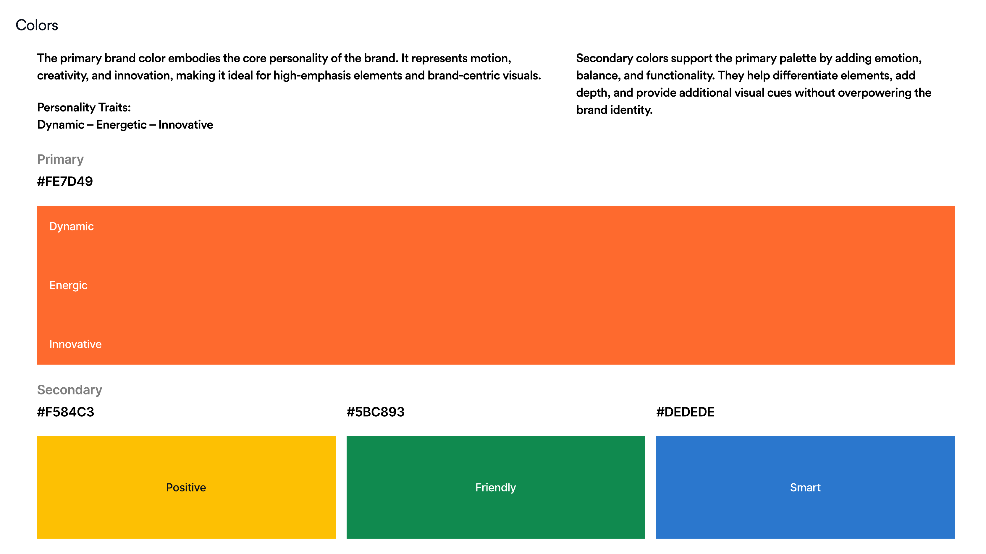
The brand system reinforced that promise.
Visual Personality
The guidelines position Pareexa.ai as dynamic, energetic, innovative, friendly, and smart, with a learning-first tone built around clarity and growth.
Color System
Primary orange "#FE6A2E" anchors the brand, supported by black "#111111", white "#FFFFFF", and a broader UI palette for positive, friendly, and smart moments.
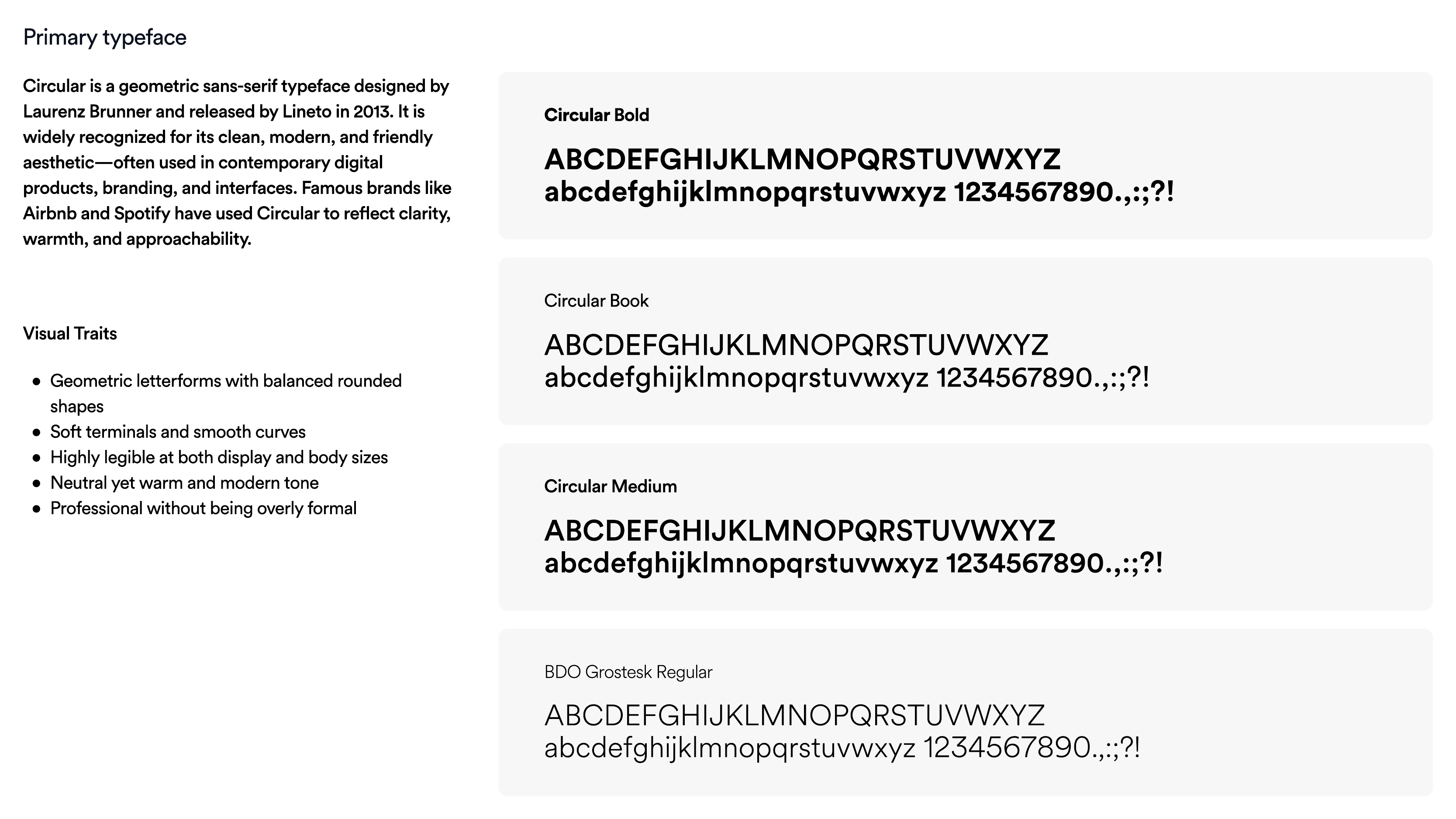
Typography
Circular is the primary typeface for warmth and clarity, while Inter supports digital readability across dashboards, forms, and mobile interfaces.
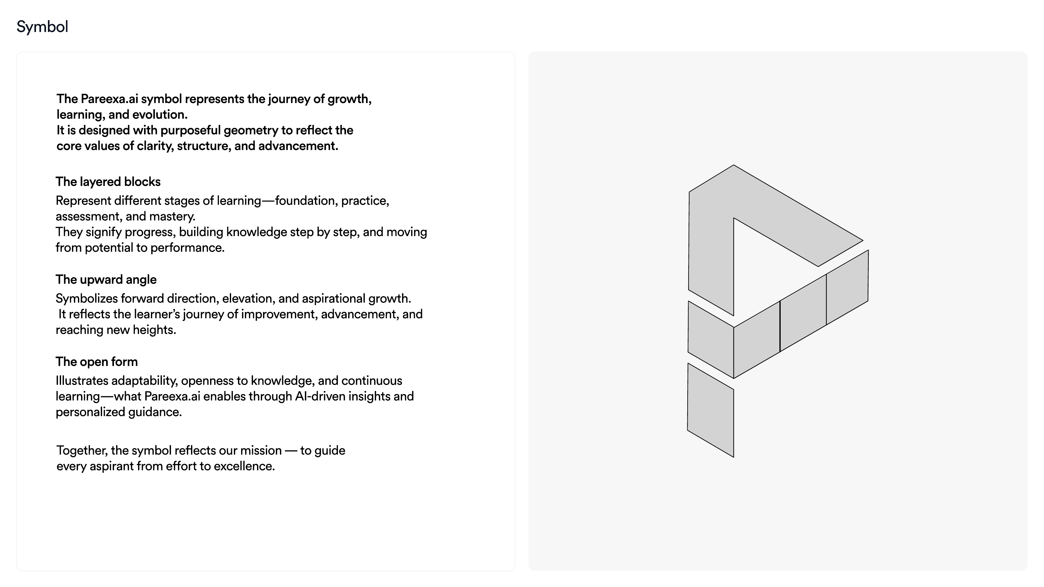
Brand symbol: layered blocks and upward movement representing structured growth.Color system: orange-led palette expressing energy, positivity, friendliness, and smart guidance.Typography: Circular for warmth and clarity, supported by Inter for digital readability.
Designing AI that users could trust — not just use.
One of the biggest product challenges wasn't adding AI — it was ensuring learners
understood why they were receiving recommendations and felt comfortable relying on
them. In a high-stakes exam journey, users are unlikely to trust a system that
changes their study plan without explanation.
Instead of positioning AI as a separate chatbot, we embedded it across the learning
journey where it could provide contextual guidance.
Design Principles
Explain recommendations
Every AI-generated study plan was based on information the learner had already shared — exam type, preparation timeline, available study hours, strengths, and weak subjects. This helped users understand that recommendations were personalized rather than random.
Keep users in control
AI suggestions were designed to be editable instead of fixed. Learners could adjust study hours, reorder subjects, or modify revision schedules, ensuring AI acted as an assistant rather than replacing personal decision-making.
Surface AI at the right moments
Rather than exposing AI everywhere, it appeared only when users needed support:
During study planning
After mock-test analysis
While identifying weak topics
When recommending the next study session
Reduce cognitive load
Recommendations focused on one clear next action instead of presenting multiple competing suggestions. The objective was to help learners continue studying with confidence rather than forcing additional decisions.
By treating AI as a contextual decision-support system instead of a standalone
feature, the experience remained transparent, predictable, and aligned with how
aspirants naturally prepare for competitive examinations.
04 🧩 Modules
Preparation needed to feel like one guided journey.
The ecosystem was structured as a learning loop rather than a collection of disconnected
features. Each module had a clear job in the journey: reduce setup friction, create study
consistency, support focused learning, simulate exam pressure, surface meaningful feedback,
and guide next actions.
This framing turned Pareexa.ai from a list of features into one connected system,
where each module had a defined job in the aspirant's journey rather than existing
as an isolated screen.
01
Onboarding
First-time activation
Introduced value quickly and moved users into personalization with minimal friction.
02
Planning
Habit-building structure
Converted large exam goals into weekly and daily study routines that felt achievable.
03
Study
Focused content consumption
Connected reading, video, notes, and PYQs so learners could stay in one productive flow.
04
Tests
Exam-like practice
Mock tests and practice loops created pressure, repetition, and confidence before real exams.
05
Analytics
Performance visibility
Scores became actionable through accuracy trends, weaknesses, and revision direction.
06
Improvement
Next-step guidance
Insights, AI help, and revision support turned feedback into concrete actions for progress.
Journey Logic6 sequential stages
Designed as one end-to-end loop: discover needs, build routine, learn, practice, analyze, and improve.
Product Scope15+ major modules
Planner, reading, notes, tests, analytics, AI support, current affairs, payments, and more within a unified ecosystem.
Structure RationaleGrouped by journey stage, not feature type
Modules were organized around where a task sits in the prep cycle — discover, plan, learn, practice, review — so navigation matches how aspirants actually move through preparation, not how the codebase is split.
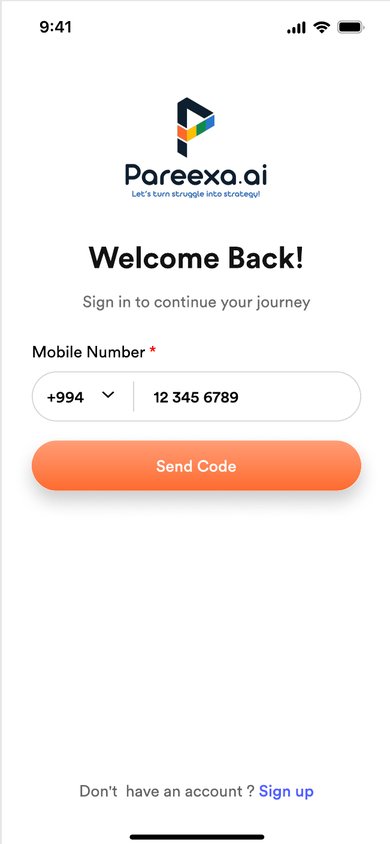
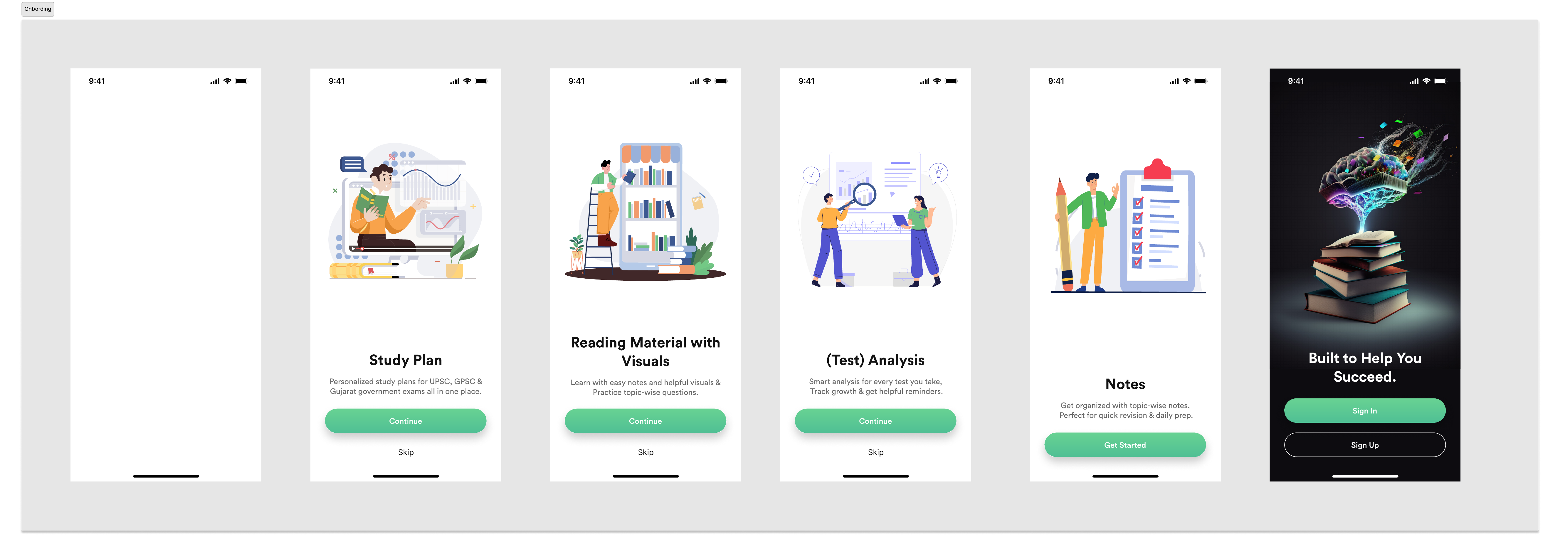
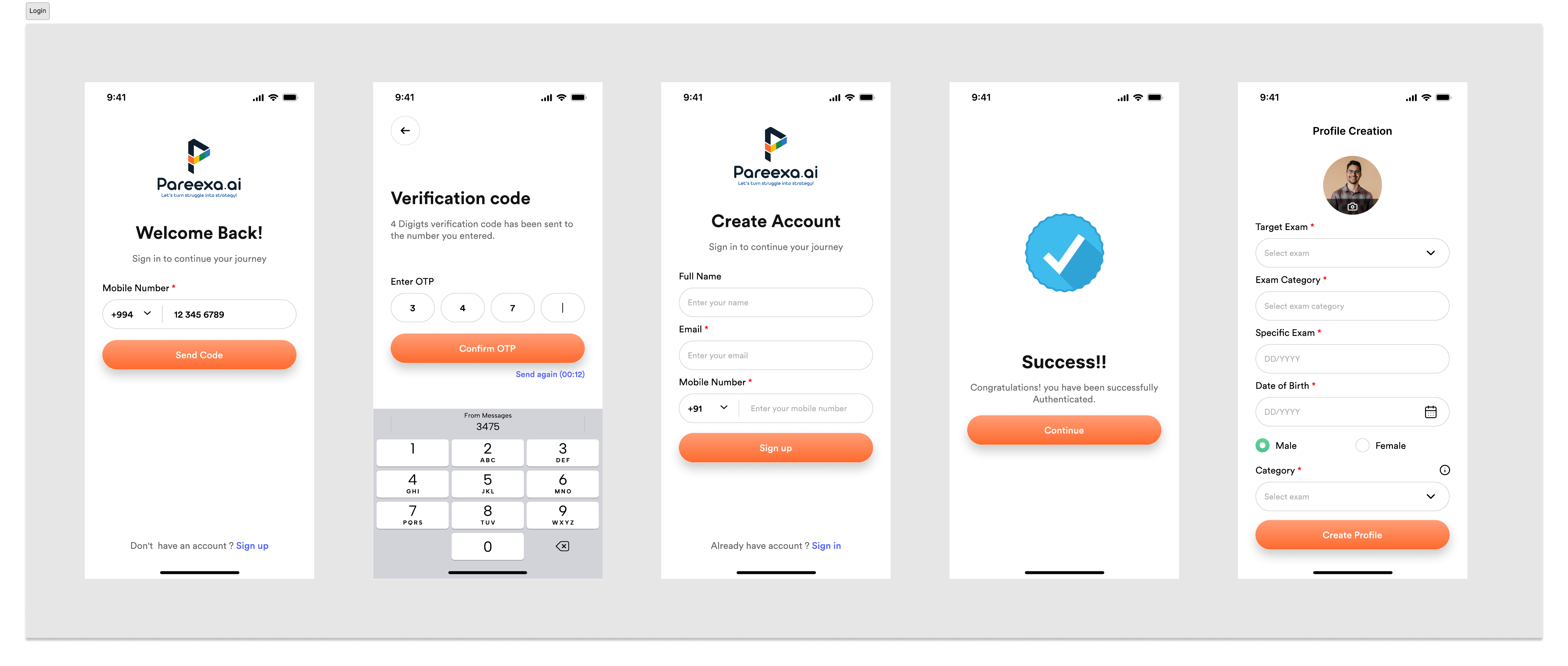
1. Onboarding and setup created the base for personalization.
The onboarding experience used illustration-driven introduction screens to quickly
communicate product value and increase first-time activation. It introduced users
to study planning, reading, and structured preparation in a low-friction way.
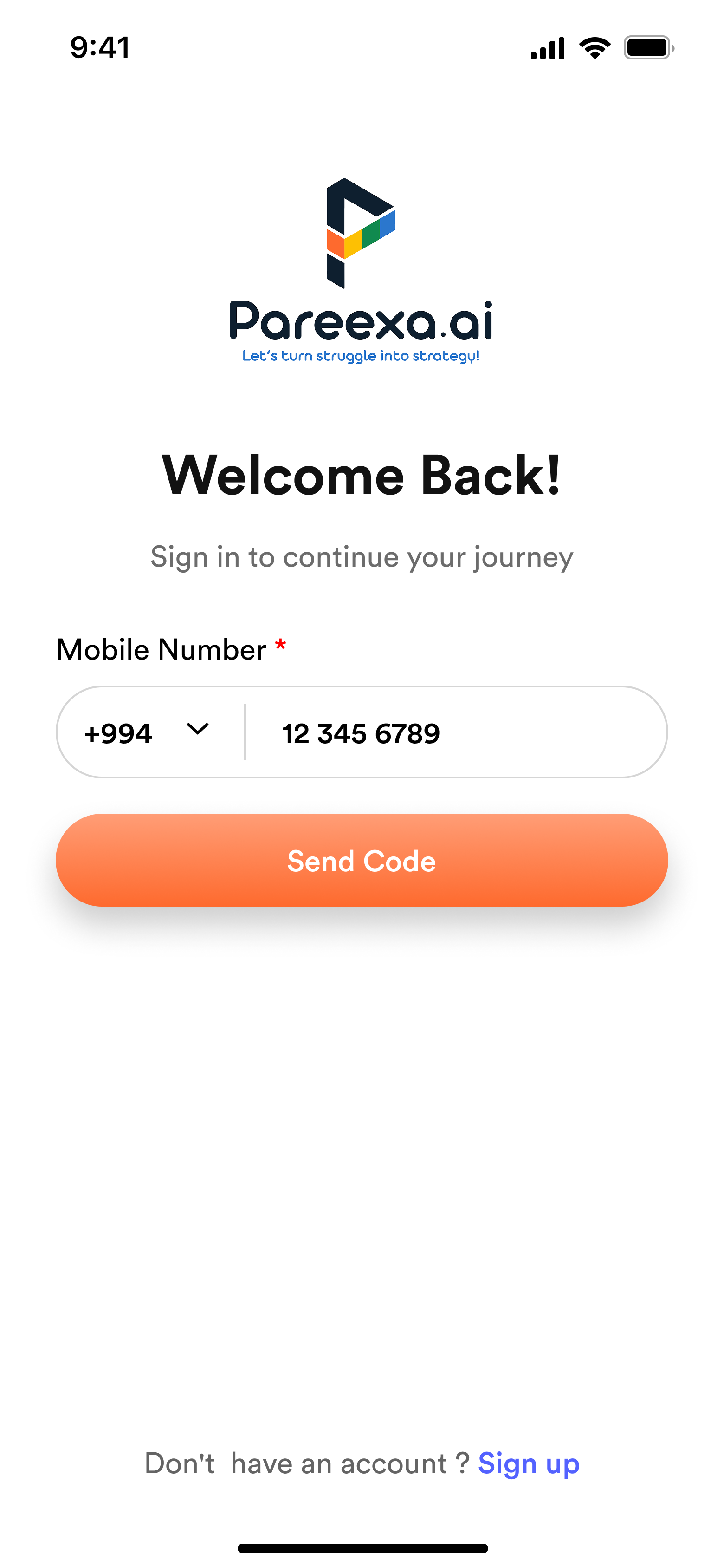
Authentication and profile setup then gathered key information such as name, email,
phone, target exam, category, DOB, and gender, so the product could personalize
study plans and content recommendations from the start.
Onboarding framed the platform as a guided ecosystem, introducing planning,
reading, testing, and notes before asking users to commit.
Authentication and profile creation captured exam, category, and learner details
needed to personalize study plans and recommendations.
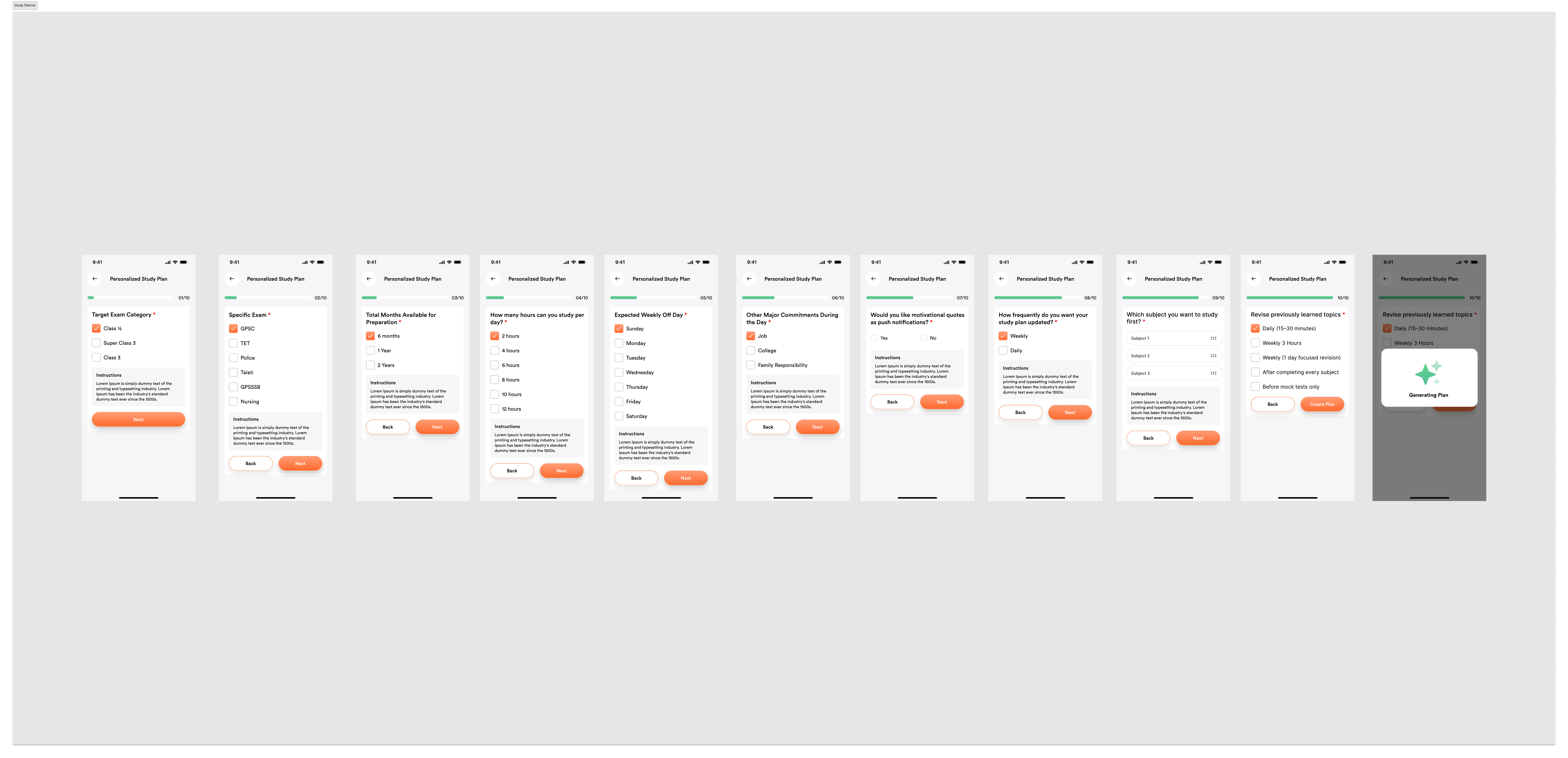
2. Study planning turned a long exam journey into manageable routines.
Planning Layer
Yearly to Daily Breakdown
Study Planner covered yearly, monthly, weekly, and daily planning so aspirants could convert large exam goals into actionable routines.
Personalization
Goal-Based Schedules
AI-generated schedules and exam-specific preparation flows helped users feel the system was adapting to them, not forcing them into generic plans.
Motivation
Visible Progress
Planning was not treated as admin work; it was designed as a confidence-building layer that reduced overwhelm and gave direction.
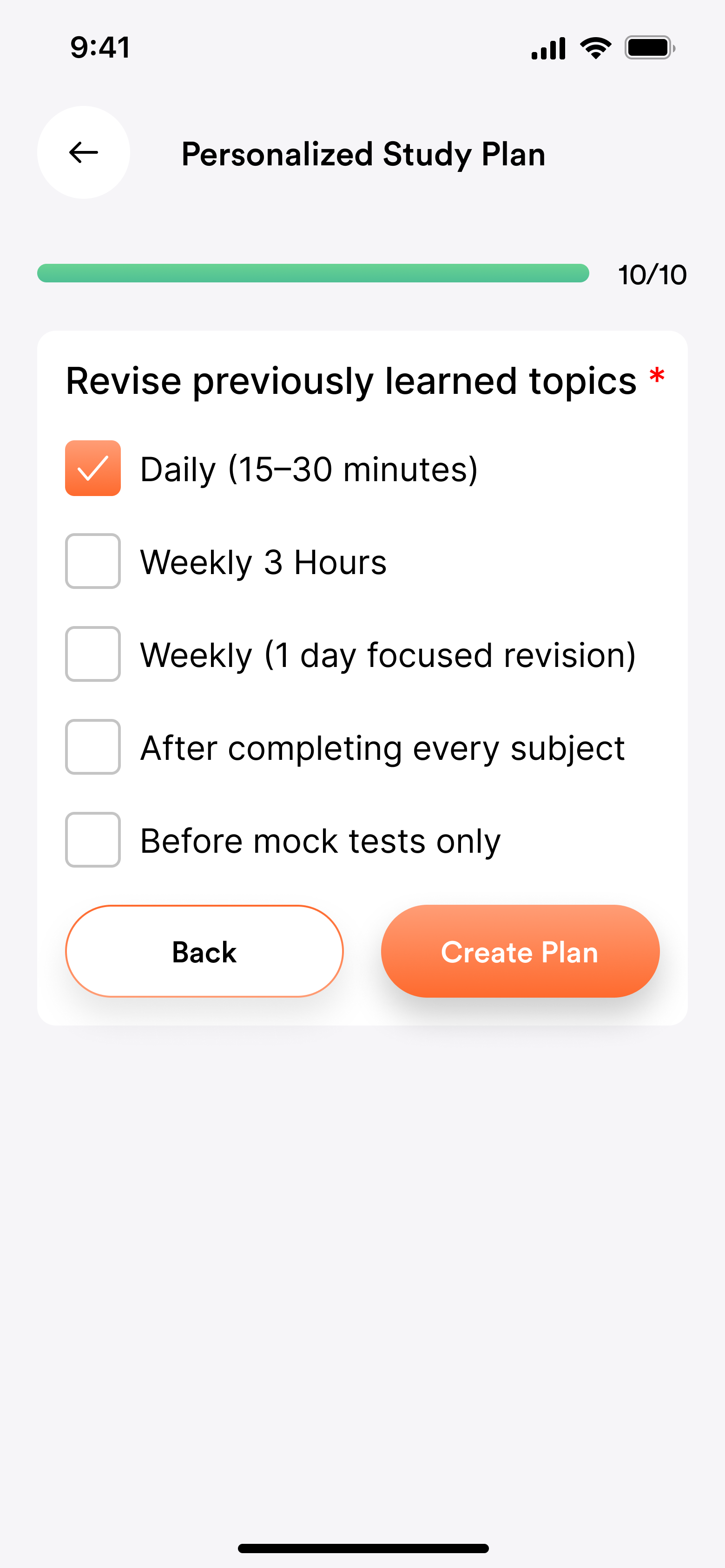
The planner translated ambition into routine through a step-by-step flow covering
exam type, preparation horizon, daily study hours, weekly rhythm, and revision habits.
3. The study experience blended reading, media, and revision support.
Reading Experience
Multilingual reading, highlights, notes, translation, and previous-year-question support helped learners stay inside one flow while studying.
Content Consumption
Text, videos, references, and contextual learning tools supported different study styles without making the interface feel scattered.
Recommendation Engine
Suggested courses, topics, and personalized learning paths gave the study module more relevance and better next-step guidance.
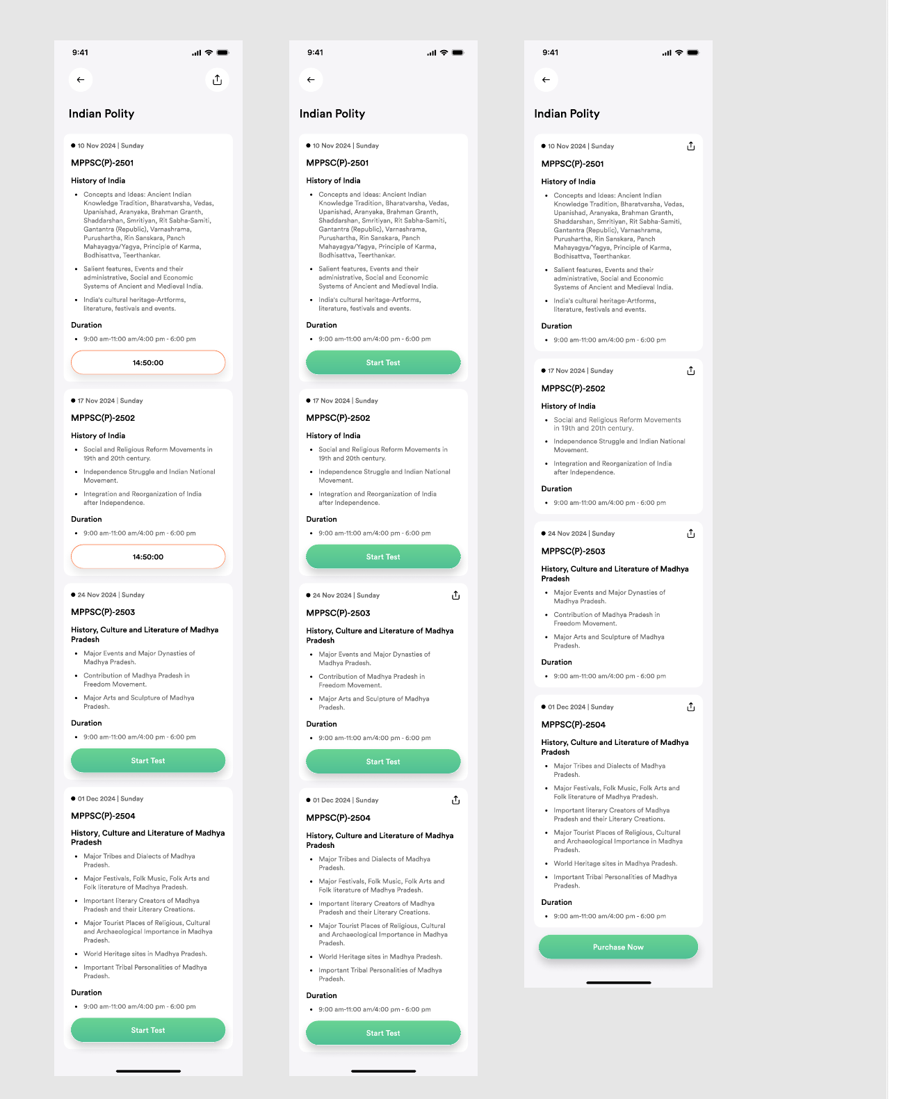
Previous-year-question support was embedded into the learning flow so aspirants
could move from concept reading to exam-style revision without switching tools.
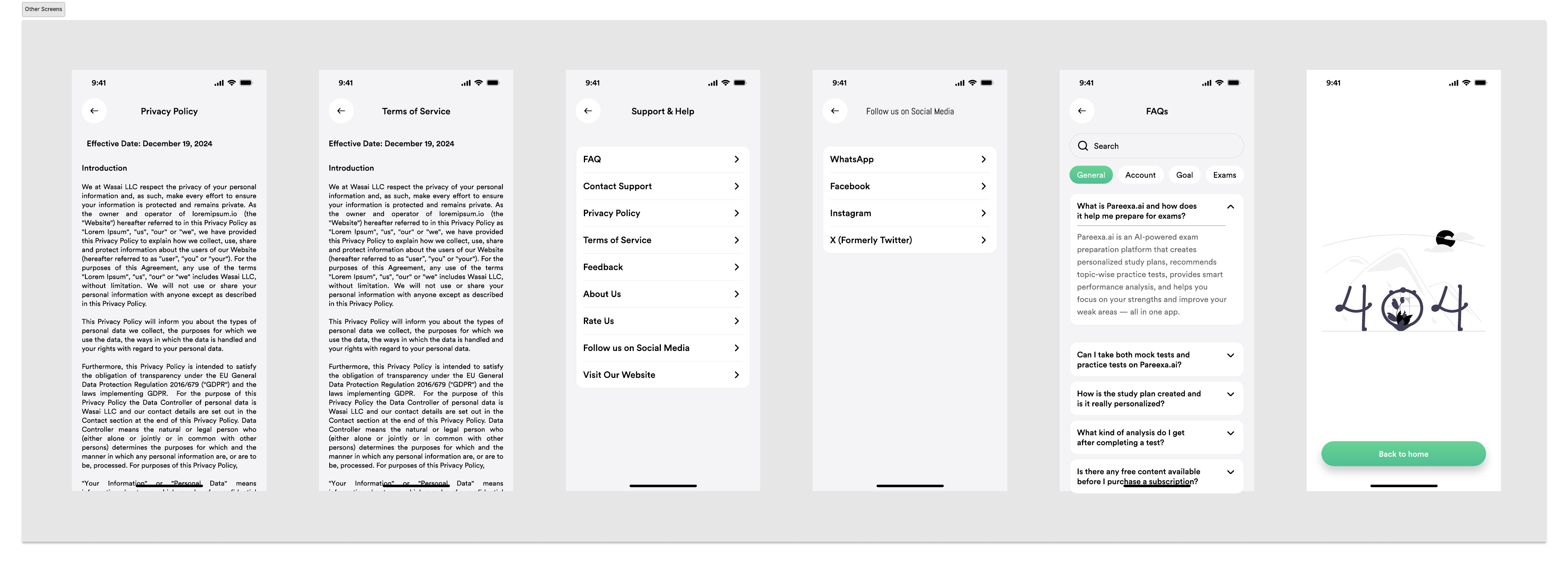
Supporting surfaces like FAQs, help, and policy screens made the ecosystem feel
trustworthy and complete rather than like a loose collection of features.
Live Prototype
Explore the full mobile prototype
The interactive prototype below is walkable end to end — onboarding, planning,
study, tests, notes, and analytics — in the same file used to validate flows
before handoff.
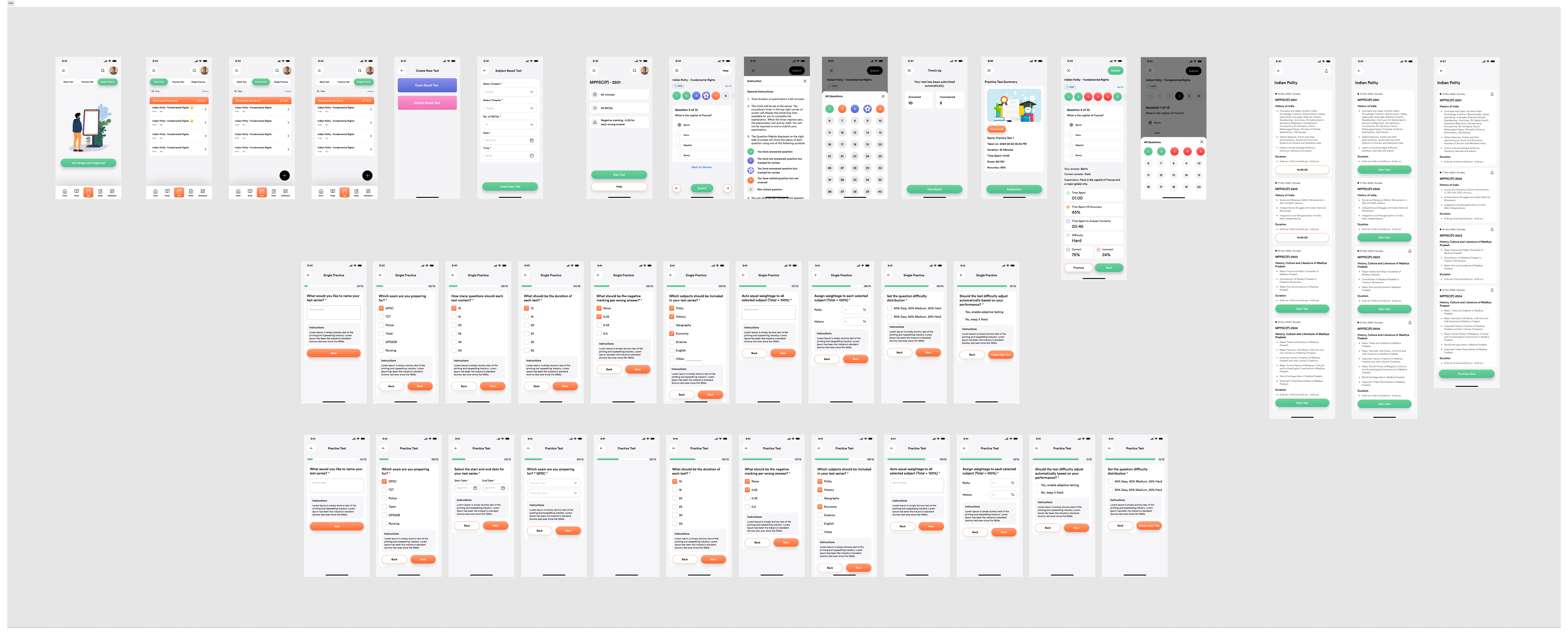
4. Testing had to simulate pressure without adding confusion.
Mock Tests Instructions Review
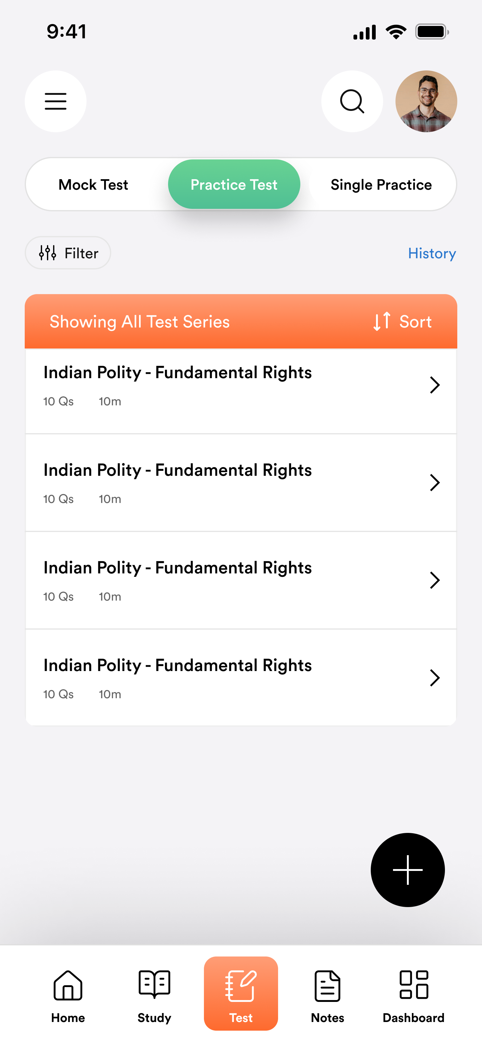
The testing ecosystem included mock tests, subject tests, practice tests, and
exam simulations. Users could create tests flexibly while still experiencing a
realistic exam environment.
Instruction layers made time limits, negative marking, and question count explicit.
During the test itself, timer handling, navigation, mark-for-review behavior,
and question state visibility were designed to reduce cognitive load.
The testing system covered mock tests, practice tests, exam setup, live question
states, answer review, and summary reporting in one connected flow.
5. Review and analytics turned raw performance into actionable feedback.
Review Experience
Correct answers, explanations, time analysis, and difficulty signals helped learners understand not just what was wrong, but why.
Question Navigator
Answered, unanswered, and review states gave users a clearer mental model of progress during the exam flow.
Performance Dashboard
SWOT, subject performance, trend graphs, heatmaps, percentile, confidence, negative marking, speed vs accuracy, and time analysis created a deeper feedback system.
Trend Analysis
Performance was framed over time, not as a one-off score, so learners could see whether consistency was actually improving.
Accuracy + Weakness Mapping
Analytics highlighted where performance was slipping by topic, allowing revision energy to go toward actual gaps rather than guesswork.
AI-Led Insight Direction
The long-term goal was not just reporting but actionable learning guidance: what to revise, what to repeat, and what to improve next.
6. Notes, current affairs, and AI support made the ecosystem feel complete.
The notes ecosystem supported creation, search, tags, and revision organization.
Current affairs were curated specifically for exam relevance, helping students
bridge day-to-day preparation with dynamic content.
The AI assistant provided instant learning support through chat and suggested prompts,
giving users a sense of ongoing guidance instead of leaving them alone with content and scores.
AI Assistant
Always ready to help
Hello! I can explain complex UPSC topics or summarize current affairs.
Can you summarize 'Doctrine of Lapse'?
The Doctrine of Lapse was an annexation policy applied until 1858...
Ask AI anything...
AI AssistantChat-based topic explanations
Current Affairs
TodayYesterdayJan 12
G20 Summit 2024: Key Takeaways for India
New Economic Policy Reform Bill Introduced
Environmental Protection Act Amendments
Digital Rupee: Phase 2 Pilot Results
See More Articles
Current AffairsExam-relevant daily updates
Notes
Search through your AI summaries...
Fundamental Duties Summary
The 42nd Amendment Act added 10...
Economic Survey Analysis
Focus on V-shaped recovery...
National Parks List
State-wise breakdown...
NotesSearchable AI summaries
Example prompts suggested inside the AI assistant, so aspirants had a starting point
instead of a blank chat box:
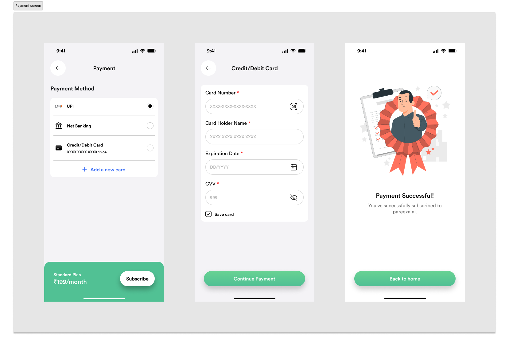
7. Monetization and support flows were designed with the same clarity.
Subscription strategy included free, monthly, quarterly, half-yearly, and yearly plans.
The payment experience was structured as a clear, low-friction sequence:
plan selection, payment method, confirmation, and success.
The screen set you shared shows how the flow handled UPI, net banking, and cards,
while keeping the plan summary visible and ending with a distinct success state.
Beyond payments, profile management covered exam preferences, purchased tests, referral
system, and notifications so the account area felt relevant to ongoing learning.
Support experiences such as FAQ, Help Center, Privacy, Terms, contact, and feedback gave
the ecosystem the practical completeness expected from a real product, not just a concept.
05 🔄 Iteration Examples
The design evolved through internal walkthroughs with the founders.
Iteration 1
Simplifying Study Plan Creation
Initial Design
The first version asked users to configure their study plan using a long
questionnaire covering exam type, study hours, revision preferences, learning style,
and daily availability on a single screen.
Problem
During internal walkthroughs with the founders, the setup felt overwhelming.
Completing many inputs before seeing any value increased friction and made the
onboarding experience feel like administrative work.
Final Design
The flow was redesigned into a guided multi-step experience with clear progress
indicators and contextual explanations. Each decision was presented individually,
making the setup feel achievable while progressively building a personalized study
plan.
Result
Users reach personalization through smaller, focused decisions instead of completing
one lengthy form, reducing perceived effort during onboarding.
Iteration 2
Dashboard Prioritization
Initial Design
The dashboard displayed equal emphasis on multiple modules including notes, tests,
analytics, reading material, AI, and current affairs.
Problem
Everything appeared equally important, making it difficult for learners to
understand what they should do next.
Final Design
The dashboard was reorganized around daily actions:
Today's Study Plan
Upcoming Mock Test
Current Streak
Progress Summary
Supporting features became secondary navigation instead of primary content.
Why
The redesign shifted the homepage from being a navigation hub into a decision-making hub.
Iteration 3
AI Recommendations
Initial Design
The AI assistant originally suggested multiple recommendations simultaneously.
Problem
Presenting several suggestions at once created uncertainty about which action users should take first.
Final Design
Recommendations became sequential and contextual, focusing on one prioritized next
step supported by a short explanation — for example, copy followed a pattern like
"Focus on Modern History today based on your recent mock performance in this topic,"
instead of a flat list of "Study History / Watch Video / Practice Questions / Revise
Notes."
Design Principle
Clarity over quantity.
06 ⚖️ Constraints & Trade-offs
Every decision balanced user value, effort, and launch priorities.
Like most early-stage products, Pareexa.ai was designed within real-world business
and engineering constraints. Rather than designing an idealized experience, every
decision balanced user value, implementation effort, and launch priorities.
Constraint 1
MVP Timeline
The product was being prepared for its first public release within a six-month design engagement.
Trade-off
Instead of designing every advanced AI capability upfront, the MVP focused on:
Personalized study planning
Learning journeys
Mock tests
Analytics
Contextual AI recommendations
More advanced coaching features were intentionally deferred for future iterations.
Constraint 2
Limited User Data
As the platform had not yet launched, there was limited behavioral data available.
Trade-off
Personalization relied primarily on user-provided onboarding information rather than
historical learning behavior, allowing meaningful recommendations without requiring
months of usage history.
Constraint 3
Large Feature Surface
The platform combined planning, learning, testing, analytics, AI, payments, and content management within one product.
Trade-off
Navigation was organized around the learner's preparation journey rather than around
technical modules, reducing complexity despite the broad scope.
Constraint 4
Building Trust in AI
Competitive exam preparation is a high-confidence activity where users expect predictable guidance.
Trade-off
Instead of allowing AI to make automatic decisions, recommendations remained
transparent and editable, giving learners confidence while maintaining control.
07 📊 Impact
A complete preparation ecosystem instead of isolated tools.
Pareexa.ai is currently in pre-launch development. My role as Product Design Advisor
focused on establishing the design strategy, information architecture, and a scalable
design system ahead of public release — rather than optimizing an already-live
product. The impact below reflects that scope: design decisions and system foundations,
not usage data or launch results.
Planning + LearningOne structured system for study routines and content engagementTesting + AnalyticsBetter visibility into progress, weaknesses, and improvement pathsAI + RetentionSmarter support, stronger personalization, and higher learner confidence
Pareexa.ai was a strong exercise in end-to-end product ownership. It pushed me to think
beyond isolated screens and design a large ecosystem where planning, content, AI assistance,
testing, analytics, and monetization all needed to feel unified, motivating, and scalable.
Product Design Impact
Designed for product scale, not just visual polish
Balanced user clarity with monetization and retention
Built a reusable design language across multiple modules
Treated analytics as a learning product, not a reporting screen
💡 Lessons Learned
Designing Pareexa.ai reinforced that successful AI products are not defined by how
much AI they contain, but by how naturally AI supports existing user behavior.
Throughout the project, several principles became clear.
Product ecosystems outperform feature collections
Learners don't think in terms of modules such as planning, notes, or analytics. They think about preparing for an exam. Designing around one connected journey created a more coherent experience than building isolated features.
AI should reduce decisions, not create them
The most valuable AI interactions were those that simplified the next action rather than presenting more information. Recommendation quality mattered less than helping learners confidently move forward.
Transparency builds trust
Users are more likely to adopt AI recommendations when they understand why those suggestions are being made and retain the ability to adjust them.
Information architecture matters as much as interface design
With more than fifteen interconnected modules, organizing the ecosystem around the learner's workflow proved more valuable than optimizing individual screens in isolation.
Looking ahead
Pareexa.ai has not yet launched, so these are priorities for validation after launch —
not results measured to date.
Validate onboarding completion through usability testing
Measure study plan adherence over time
Evaluate AI recommendation acceptance rates
Improve personalization using behavioral learning data
Introduce adaptive revision planning based on long-term performance trends
 Arpan Sheth